@luxamman, I really the desktop login of V27Nov17, it really feels like Ubuntu!
Also, about the terminal. As a red/green colorblind person, I really like the default terminal color scheme of ambiance, it makes the colors easy to distinguish for me. I don’t know who created that but they really put some effort in that! Adwaita’s default color scheme on a light background is unusable for me. In general, dark terminal color schemes are better imo.
Might be interesting to see if someone has done some research on terminal color schemes and accessibility, there’s like a whole community dedicated solely to terminal color schemes…
Sure we can think about the color’s in the terminal (I guess they are part of the theme as well) to find a solution for all of us to work. Even if it is just the change of a color, so as not to get too close to red/green. An interesting aspect that I would not have come to!
Personally, I also like the dark terminal much more. The slight red in the background is also a hint that this system is using Ubuntu. The white background in Gnome combined with the bright green is also for me a problem, the contrast is so little, you always have to focus on the words that just make the eye tired and is hard to read.
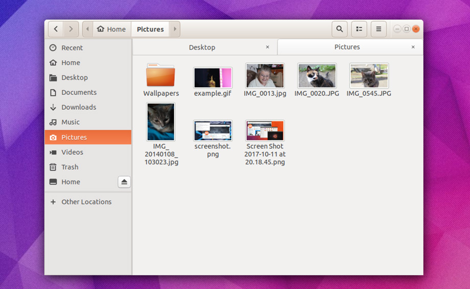
The tab concept seen in Files 26Nov17_Tabs might not be possible (without relying on external assets, anyway). How about something like this?
I think if we’re removing the headerbar button borders then it should only be for buttons that aren’t linked to something else. This is useful for maintaining relationships between buttons but also (and mostly) to avoid situations like the following:
you are doing an awesome work, there are something with corners and transparencies, I made a video about the windows behavior. maybe it helps you to take a decision about this.
@luxamman Nice job! Again, off the top of my head:
Back/forward buttons with border to fit the design (wfpaisa and godlyranchdressing)
I really think it looks better without borders or maybe it’s just the border in your mockups that are too thick?
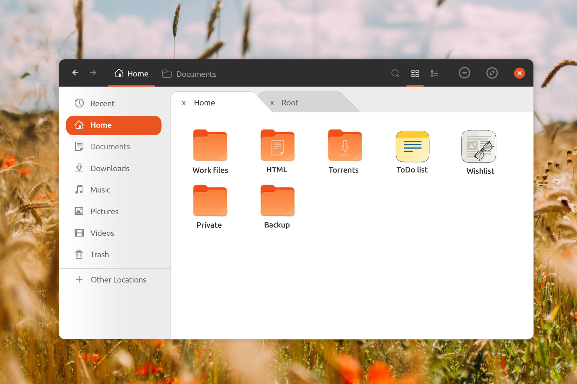
Changed the folder highlight (folder list) color to have a fluid transition to the shown files and folders (madsrh)
Did I say that? Gray and white are fine, but I’m really missing the Ubuntu branding here. Does there need to be a fluid transition?
Breadcrumbs change to fit the design with a slight background color for active elements like on the dock (wfpaisa, godlyranchdressing, and madsrh)
This one is tricky. I see what you’ve done, but like I said, I’m missing the orange. Perhaps we could try the opposite and use orange for the application in focus in the dock?
There’s something with the colors in Nautilus that makes it feel a bit dull. Perhaps try a lighter gray in the sidebar or an almost white as the files/folder background.
Isn’t the black border around the window too much? I would try thinner or gray or both.
Impressively quick response time for the feedback we provided a few hours ago
Also like it more without, the rendering is not good out of XD so I added a shadow to make it a little less look like Windows 95 times
I guess we need to see that in real to find the perfect way, for now, I deactivated the shadows.
Okay, I just did not give too much attention to the content till we have an overall design. But I gave it more space^^
I tried that, have to say I don’t like it, the dots are just right for me and the white gives a quiet note and is never wrong with colors from the icons.
For testing I set them back to original colors and the window borders are reduced from 2 to 1 px.
The CSS in the Shell is kind of limited. I think the safest bet would just be following suit with default GNOME and using a background image placed on top of a solid color. Something like this:
I just don’t know what pattern will both look good and look like “Ubuntu”
Maybe you can take a look at this site to get some inspiration?
How about something like this? I tried to replicate this mockup but the stackswitcher buttons which I were hoping to function the same way as the path bar buttons can’t take up the full height of the headerbar without resorting to tricks. I’d rather modify the design to work with both rather than leave the path bar buttons being inconsistent.
Yes, I really like the gray thing we both use in our current mockups. What I was suggesting was something that is more UI consistent and therefore gives a more cohesive user experience.
I don’t like the first one with the line, too much going on to have orientation at a glance.
The second mockup could be working for me, but I would try to have orange when active and bright grey when not active. But maybe this is too much of MacOS?
Yeah (I know, windows…). I will try this in the mockup.
I spend some time in Ubuntu 17.10 changing the ubuntu.css to test the main colors (could not change the window decorations/frame, just don’t find it till now) and the top-bar and dock are looking good in #252525 or rgba(37, 37, 37, 0.98) and also down to rgba(37, 37, 37, 0.95), then it starts to lose focus to transparency (until Gnome implements blur). The proposed #2e2e2e is a little too much like the old grey for me and not as stylish as the darker tone.
When jumping to a maximized window the top-bar gets a little darker and no transparency anymore to rgba(25, 25, 25, 1.0), the transition is soft and cool by setting it to 1000ms in both cases. And it feels a little like a more content focus mode. I really like it! Also fun just to play around with windows now to see the sleek transition^^
But like always this has to be tested on different screens to find the right grey (always test mockups in fullscreen!) and of course the window decorations/frame still have the wrong colors and the dock is not changing color with the top-bar and I could not test box-shadow for the top-bar in standard mode, but in maximized window it works…
Speaking of greys, as a FYI, most of the greys in GNOME Shell by default are something like (in rgb): x, x, x+2, making a blueish grey.
For 17.10, we turned the grey to be more brownish (and warmer), it’s really easy to spot the difference when you switch between the 2 values! For this, I simply did: x+2, x, x.
I’ve been looking at themes like Arc, POP, Adpata, Radiance, Minwaita, Gnome OSX and United and ALL of them have straight edges at the bottom. Only Elementary OS have rounded bottom edges and it’s only a few pixels. This would certainly make Ubuntu recognizable.
Sound like Ian says its possible, but I know nothing about coding, so please let me know if we have to kill this concept for good.
Yes, they’re certainly possible. You need to make sure that every widget with a background color set has the same radius for the bottom corners (or at least for those that align with the corners of the windows). But if you do that, everything works normally. Pop even includes support for granite .rounded style classes for applications that use that, like Dan Foré’s Harvey.
This doesn’t necessarily means it’s a good idea. It’s imposing a lot of restrictions and could very easily break some apps in corner cases (no pun intended), so it’s probably better to go with a much more subtle rounding. Extremely large radii on windows don’t improve usability.
Funnily enough, I spent some time in Unity 8 yesterday and the .95 alpha value used there actually seems to be the closest approximate I could get.
I’ve been testing the Shell menu colors. I used the original #181818 with the same .95 alpha, seen here:
At the very least, it’s feasible for dialog windows. There’s also always the Shell.
I just did this in an attempt to mimic Unity 8’s dialog windows (which use whites and grays) and open us up to not having to stick to blacks and grays for everything, but they can be styled based off of your mockups.


 Can you post it elsewhere or send it via WeTransfer? I’m getting:
 , ok, I remove the song
  Gray and white are fine, but I’m really missing the Ubuntu branding here. Does there need to be a fluid transition?


