Overall more focus on a basic theme and on what is actually possible, not on changing lot of stuff/details to get a whole new look.
Sleek and defined with a good overview with a bit of a “futuristic design” without getting lost in transparency. The rendering of fonts and lines are not good, unfortunately. Also (like proposed) changed the dark grey to #252525 to see how it works.
Login V27Nov17
- Points pattern and a white layer over background (like discussed and reinterpreted)
- Focus on login
- More rounded window corners
- Transparent color on the button to focus on the next logic step, but not to judge what is right or wrong

Main Desktop V27Nov17
- Bar / Dock transparency reduced to 0.98 because of the overlapping windows

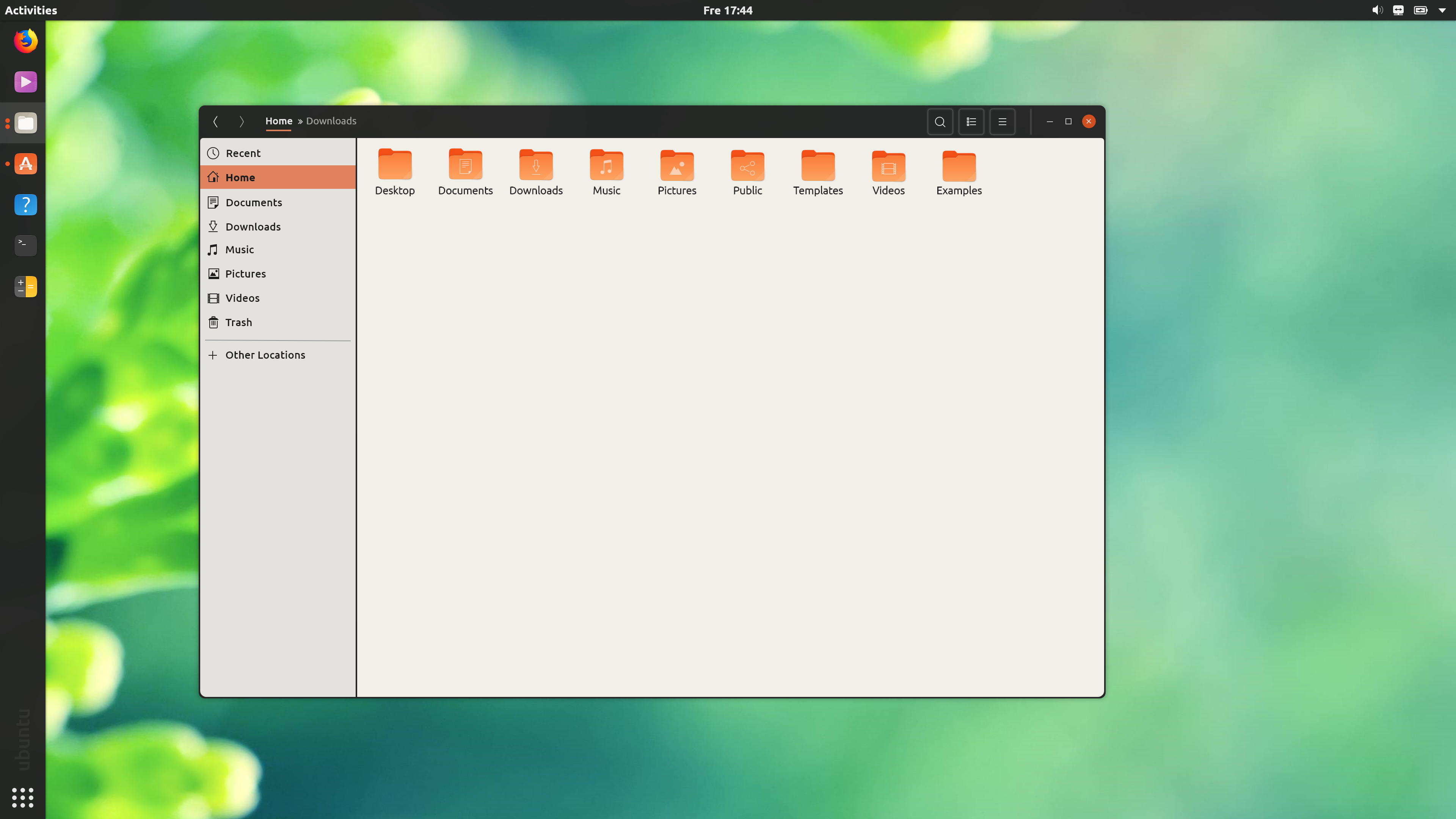
Files Window V27Nov17
- Breadcrumbs smaller and simplified, less overwhelming, no space-consuming icons
- Combined (from other mockups) window buttons - min/max without border, close button in flat Ubuntu style
- Back and forward buttons without border
- Search, list and menu buttons with border, it was too loose/unclear without
- More rounded window corners
- Transparency reduced to 0.98 because of the overlapping windows
Files Windows Overlap Test V27Nov17
- Transparency reduced to 0.98 because of the overlapping windows
- Windows behind windows become a little brighter, more transparency would look too confusing with many windows but needs adjustment (until Gnome implements a blur effect)

Files maximized Window V27Nov17
- No window / dock / bar transparency
- Still shadow to separate top-bar from window

Terminal & Calc Test V27Nov17
- Based on the actual app design
- Calc button colors for better overview
- Terminal in Ubuntu terminal background-color (a terminal must be dark
 )
)
