Mockups/new design discussions

I suggest that @luxamman and @madsrh lead here.

We want to have this new theme feeling like ubuntu, which means, respecting the Ubuntu (and maybe ex Ubuntu Touch?) color palette and style. We don’t want to change add/remove extensions or change GNOME Shell behavior more than we did in 17.10.

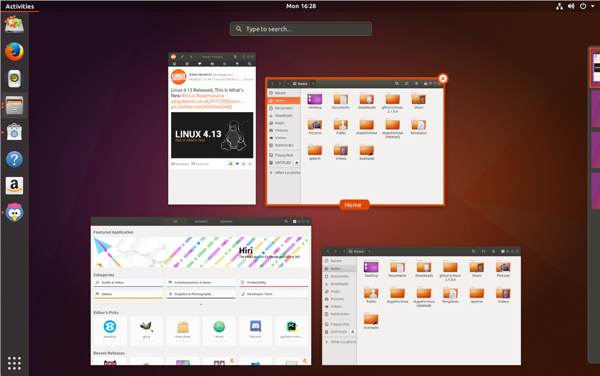
I think the research should start from installing gnome-session package on a fresh Ubuntu 17.10 (you need to never have changed your theme), logging into the GNOME session in GDM (which has the vanilla GNOME look and feel) as this is our starting point to check default Shell, icon and Adwaita (GTK) themes.

Of course, the rest of the team (and I will try to get some people from the design team coming by) is around for any questions!

For reference, the ubuntu design website (having color palette and other useful informations):

Ubuntu touch color palette:
http://colorpeek.com/#f7f7f7,cdcdcd,888888,666666,5d5d5d,3b3b3b,111111,e95420,762572,ed3146,3eb34f,19b6ee
In order of appearance:
Porcelain. Recommended for foregrounds.
Silk. Recommended for neutral action buttons and secondary text.
Ash. Recommended for subtitles and other tertiary content.
Graphite. Recommended for coloring dark themes’ background.
Slate. Recommended for text and action icons.
Inkstone. Recommended for foreground colors in dark themes.
Jet. Recommended for content coloring.
Orange. Recommended for branded elements, display progress and intensity, textual links on light backgrounds.
Purple. Recommended for proper nouns in list items.
Red. Recommended for negative and irreversible action buttons, errors and alerts.
Green. Recommended for positive action buttons.
Blue. Recommended for text selection and text cursor.

For more informations: Call for participation: an ubuntu default theme lead by the community? - Desktop - Ubuntu Community Hub

Feel free to post any source of inspiration and I let you leading from there! :wink:

8 Likes

Hello Didier,

thanks for inviting me to the team, I will do my best and the utmost to make the Ubuntu desktop shine in a new design. And also hello to the rest of the team! :slight_smile:

I read your post, thought about it and some questions came up like:

  • The basic orientation: Are there any elements and designs that are already known? Like the Suru icons for example. Because these icons would define a certain line with their design, playfulness and the colors - which we would then have to adapt. Or is everything still open - of course based on Gnome and Ubuntu?
  • How we will work together: How do we communicate with each other? How do we exchange data and designs? Like Trello, Google Drive or something like that? Of course, how will madsh and I work together? Maybe we can use the same software for designing etc. like Adobe XD (which I used in “Finding Ubuntu”).
  • What are our design possibilities? What elements can we change and so on. Besides, how much we can change them. But that will also show up in the process, I think.

It does not have to be answered immediately, just so you know that. There are certainly more questions coming :wink:

Then I look forward to the cooperation and the first steps. A fresh installation with the gnome-session is already set up for research.

Greetings, Stefan

2 Likes

Good questions Stefan :slightly_smiling_face: We need these answered before we start, although I think the plan is to stay as close to stock as possible (no moving the clock etc.).

I had a brief look at your “Finding Ubuntu” document - lot’s of good stuff. One thing that I also would love to change is the Activities button. It jumps right in my eyes that the dock width and the Activities button does not lineup. As you’ve mentioned there’s an obvious branding opportunity here (No need to look over the fence), but even more critical: Activities is, at best, a wage term. I can’t even begin to imagine how this is translated and what meaning it has there. I know that there is filed a bug regarding this, but has been marked as won’t fix. Let’s hope this doesn’t apply to this theme :wink:

I’ll have to take the XD tutorial again if that’s the tool, but I speak fluid InDesign and PS :grin:

Alan have made a thread for communicating here or you can always throw me an email/PM/…

Didrocks writes about the icons here - hurray for Sam!

2 Likes

Hey guys!

Let me try to answer to some of your questions, as best as I can :slight_smile:

The only thing that is set in stone I think is the usage of Suru icons. Making an icon theme is long and can be tedious, let’s use the many years of excellent work from James and Sam! The rest is up to us. We can even imagine having a greyscale scalein the appmenu (look at the GNOME vanilla session) for application icons as upstream has.
The only limitation (if it’s one! ;)) is that it needs to feel “ubuntu”, meaning, The links I pasted from the ubuntu design website, the color palette, fonts and general guidelines, have to be followed IMHO to get that feeling.

This is up to you! I would really like though for openess though that we communicate on this community HUB mainly, and this is why I created this thread, some on CI, another one icon! However, you are free to create more threads in Theme Refresh - Ubuntu Community Hub. This space is read-only for people on the hub, but write-mode for the team working on the theme. This is basically our space to communicate :slight_smile:

In term of tools, I think what fits the best both of you (part of Canonical design team is using a pencil and scan them, another part is using Adobe, some are using the Gimp). However, it would be cool if you can export assets in a free format, like png, svg or xcf, so that the developers are able to open and see them without messing with another tool.

We can even operate as GNOME designers are doing: using a git branch and committing/sharing assets there: https://github.com/gnome-design-team/gnome-mockups/commits/master. I’m happy to create a branch in the ubuntu namespace and give you access to it if you want to.

So, we don’t move things or change any upstream behavior. We want, as @madsrh said, being close to upstream. It means that you have all CSS power in terms of transparency, border layour, gradient, colors, size and effects, but without changing the layout and placement of objects.

There has been a lot of discussion both upstream and on Fedora on this. I think we should discuss that with them (#gnome-design on gimp.net IRC network). I don’t think we should start on that front, knowing there has been multiple reluctance on this to not block us. The general idea is still to be close to upstream’s philosophy, with some ubuntu salt :wink:

I hope that answers your questions!

Hey,
thanks for the answers!

Like @madsrh I also have to jump on the idea of activities. Since the dock in Ubuntu gets the main focus, it is irritating that the top-bar still wants to be the focus (as in Gnome). Of course, the nicest way would be to stretch the Dock up and the top-bar starts from the dock. But that will probably be too much effort and change, even if it were the right way (like my mockup in http://ubuntu.luxam.at/part-2-design-overview/).

Compromise for me at least would be to just hide “Activities” and have the Ubuntu logo icon as “Activities” replacement on the Dock top. Even if there is an empty spot above the dock… maybe we can stretch the dock over the top-bar and if the Ubuntu icon has no transparency, you will not see the top bar below (the window settings should move to the windows anyway). And it would be less confusing and more beautiful.

Of course there would still be the controversy with activities and apps, I would really like the Activities window / menu having an app list with small icons on the left side - or something like that.

I’m sure we can find a way to make this work with just stretching the boundary’s, especially because the Dock is a fork developed by the Ubuntu team.

@madsrh, I also started my design with InDesign, the XD is very similar but more easy for that kind of work (including the really nice webshare feature). But I guess we deliver PNG’s so it is just important to us and we could share a folder in the Adobe CC.

So I guess that we start with trying the icon set, because I need to see how they work on the actual dock with indicators an so on. Also for the actual release: the Dock has too much transparency, on some backgrounds it just like the icons are on the desktop.

Thanks and let’s kick off :slight_smile:
Stefan

1 Like

@madsrh @luxamman

Though I’m not too big on the idea, instead of replacing it with the Ubuntu logo, why not replace it with an icon similar to Windows 10’s Task View?

10taskbar

Instead of Activities text, it would just be the Activities button. It’s less ambiguous (I side with the reasons listed here), has been done in a couple themes, and would leave the app drawer open to being styled with the Ubuntu logo instead. With the app drawer icon being the Ubuntu logo, there’s the benefit of it being a Start Menu analog as well as being a throwback to Unity.

2 Likes

Regarding to this, I’ve to mention that while I’m not a fan of having the app list separated with activities, and not having the ubuntu icon as selector, removing Activities would cause a loss of not being able to spread all the windows using mouse, and the same time it’s not possible without patching or using an extension which would cause us to increase the delta with gnome-upstream, which is a thing that we prefer to avoid.

So, for such discussions (like all the layout changes, not involving the extensions we use), I think it would be better to get involved with gnome-shell upstream designers.

1 Like

I’ve been working on a few mockups, but I would like to know if we’re going for a light or dark theme?

I think we should base the theme around the work that the Canonnical design team did for Unity8. Take a look at this. I like the black dock, tray and window titlebar, while still keeping the light window elements.
This is exactly what is found in the awesome work by @godlyranchdressing here:

https://raw.githubusercontent.com/godlyranchdressing/United-GNOME/master/preview-3.jpg

https://raw.githubusercontent.com/godlyranchdressing/United-GNOME/master/more-previews/regular-shell.jpg

We don’t want to just use the United theme, but should we try to create something along these lines? As Didrocks pointed out we’re starting code afresh, from Adwaita for GTK theme, so it’s not just a rewrite of the United theme code. I have a lot of things I like here and a few dislikes, but I think it would be a great base for inspiration (and stealing :wink:).

What do you think?

That’s a good question, after a few tests and experimenting I like to propose a darker them. I tested the icons on the actual desktop, the white theme was just not fitting (and too much like macOS), also the complete black was too much.

Mockup (updated without gradient):

As you can see, I don’t use black, it is a dark grey with just a little transparency/blur to let the background shine thru. Also the fonts are not pure white. So the contrast is not too much, because the eyes get quickly tiered on high contrast.

Also the icons on the Dock have been scaled down a bit in size (they always were too big since Unity) and with the dark background they look more serious. It’s important to me to give Ubuntu a serious and calm look (grown-up). The indicators are nicely presented as well, a gradient shows what app is in focus. The icons on the right also have the bright grey, only the battery icon is horizontal, not vertical because I think that’s more practical.

Also important: To not change third-party icons like Firefox and so on. I think I don’t need to tell you why… We should not patronize others.

So that could be a start-point.

And related to the discussion about getting rid of “Activities” I read the comments and the discussion about it at the launchpad: as long as they say thinks like

My initial thinking is that the Ubuntu logo alone in the top left corner might not be as obvious that it is a button that users should press?

(like in many other OS) or because “the documentation of gnome tells different” we are probably on a lost ground. Let’s hope the Canonical team will have a long look on that point. Maybe there will be a solution to be more clear and to differ more from Gnome.

Greetings, Stefan

4 Likes

+1 for gray in the topbar!

What springs to my mind at first glance:

  • Isn’t the dock a bit too wide? Perhaps it could be slimmed down a few pixels?
  • Why a gradient behind the app in focus and not just a solid color? It makes it just a teeny-tiny bit harder to spot which app has focus.
  • Perhaps Activities and the clock should use the regular font and not bold?
  • I would still prefer a solid black but that’s just me :o)

Upstream is using some transparency by default when no windows is next to the panel (and we did the same with Dash to Dock), I think this mecanism should be kept as it has been quite praised by the community. No issue to havae your darker version once a window touches it.

I just wanted to add: please keep in mind that the Dock can be as well in Intellihide mode, and so can potentially cover active applications when revealed. This is a state that needs to be taken into account when tweaking transparency :wink:

Also, remember that the icon sizes can be resized. A nice default (currently a little bit large, I agree), needs to be define, ofc :wink:

I really think that for step 0, let’s not move any item at any position. That way, we can get something out and then, refining.

Nice starting work! I didn’t get an answer on the “hosting final mockups”. I see 2 things:

  • a topic dedicate to those (that we post in the same section), and when one mockup evolve, you just edit the post to replace with the new one
  • a github branch

As you prefer! :slight_smile:

1 Like

The transparency mechanism is fine, I suggest that the range of transparency switching should be more of a visual feedback. Currently, the transparency changes very much what looks less elegant, the whole design changes a little and of course especially the Dock and app launcher dots have a hard time to be visually present on some backgrounds when the Dock is very transparent. I don’t see a big problem with hiding active applications, because the Dock is just popping in for a second and maybe we can set a different transparency in that mode. Also less transparency gives us the opportunity to get rid of the text shadows, because the whole design is heading to be more flat and this would help.

About the icons on the Dock: when resizing the icons in the settings, they start to get a little blurry and everything including the dots and the Dock itself is resizing. So when shrinking it down, it gets a little crowded and the overview gets worse. For our purpose - only resize the icons itself in default, leaving everything else like it is (maybe by setting padding). But need to be tested with the new icons and looks less like for tablets and small screens.

And:

  • Is it possible to give the top-bar and the Dock a shadow?
  • Is it our decision to move the window settings to the window and away from the top-bar?

For the mockups I’m fine having a simple (no discussions only designs) post, maybe because I’m not used to github. I wanna keep things simple… but I also can handle github if necessary.

thanks, Stefan

Just be aware that if we override different transparency values between intellihide/non autohide, it means that when people will switch between the 2 options in Settings, it will reset to defaults values, overriding potential values the user tweaked. As this tweak is done via Dash to Dock or gsettings directly, I don’t think this is a common use case (also, it will be only when they switch autothide on and off), so having different values is fine by me.

That’s exactly how Ubuntu Dock (and Dash to Dock) behaves: it only reisze the icons and leaves the Dock padding the same. But yeah, let’s test with correct icon set.

I just gave it a try. You can use box-shadow on the panel (and so, Dock). However, this shadowing is drawn on top of application windows (window titles) unconditionnally. I think we need thus to only display it when it doesn’t have the .solid state (meaning, no window next to the panel). The issue is that if you bring a window next to it, it will disappear before the window covers it.

Not sure to understand what you want to move? You are talking about the Application menu?

Ack on the design post, feel free to create it and keep it updated! :slight_smile:

Sorry yes it’s the “Application menu” - right next to “Activities”. There is a tweak or extension to move it right next to the windows controls, what in my opinion is much more logical - especial on bigger screens. A other solution would be to just implement it into the right click menu on the Dock icons and deactivate it in the top-bar, because this is also a good place where to expect them.

Yes that’s true, but the dots are too small when the icons seem right. Also it may help to give the dots a little more space - this would include move the icons a little out of the center. I will try it with the mockups.

When you maximize a window in Ubuntu 17.10 there seems to be a shadow on the window from the top-bar. So, is it maybe possible to give the shadow element a z-index to have the shadow behind the windows when not maximized (or fake it somehow)? And when that is possible, maybe we can fake a shadow on the Dock from the top (like a inner shadow) to separate the top-bar from the Dock?

And will the trash have a comeback as an icon on the Dock?

thanks!

No worry! So, I would say the same than for the Activites section: we don’t want for now to diverge from GNOME Shell design and move it somewhere else. I’m trying to get some upstream design people to come/read here your suggestions (and you can go on #gnome-design on gimp.net IRC to chat with them). Anyway, let’s focus to get a first version of the theme on the theming part itself: icons, shadows, color scheme, transparency, more than on behaviors. That will give us a good visibility and small stepping stones where we want to be at. Then, we can revisit and discuss for incremental improvments. :slight_smile:
We can makes some changes (if upstream agrees) on dash to dock, like duplicating the location of the menu and adding it there (just not removing them).

That’s actually not what’s happening (changing z-order isn’t supported in GNOME Shell AFAIK). The title bar is style on maximized panel to look like there is this shadow, same with unamixized style of application title and headerbar. We can play with this :slight_smile:
Styling the Dock is possible, I’ll let the devs who volunteered to answer and give it a try :wink:

The trash on the Dock, I think some people opened a bug report on Dash to Dock to get it implemented and they had nothing against. Unsure the work started on it. The issue is about matching the file manager to show the corresponding “active” application (not Files for instance, when you are on the trash, but the trash icon). I would say the same than for the rest: let’s not focus on this in particular right now, but we can take it into account :slight_smile:

Ack on the other changes, good luck! :wink:

There’s separate “.transparent” and “.opaque” classes for the dock, but only the transparency value seems to be affected depending on whether or not a window maximized. I tried adding a box-shadow rule to the “.opaque” class but it was ignored. If you want a shadow to separate the dash from the top-bar it’ll have to be there regardless of window state.

On the Application Menu’s behavior, you might be interested in this discussion from a couple of months ago.

So for now we’ll focus just on designing the theme :slight_smile:
Maybe just a few tweaks here and there^^ Would be nice to also work on behaviors and improvements when the time is right.

@didrocks and @godlyranchdressing thanks for the input! I guess we can find a way to make things like the top-bar shadow work if we need it. It’s just a detail, but details paint the whole picture.

I will upload the first design proposals soon in the “Design Mockups (Updates)” topic, with the Suru icons, a less wide dock with more space for the dots and some elements with the icons design in mind and so on. But work in progress, also the fonts may seem not rendered well sometimes. And have a look at the icons in the right corner, seems they are maybe too fine drawn (like on a 13" Full-HD laptop screen).

Because the icons have rounded corners windows, buttons and some elements have also rounded corners. I also try to use certain colors to specify functions and get the users focus where needed and of course because the icons are also colorful (but not too much, of course). The dark bar and windows always form a quiet frame, so as not to distract from the content and the functions. Maybe we’ll get a kind of “Playful elegance” :grin:

Questions for now:

  • The icons have a slight (sharp) gradient in the background. Is that possible for elements (buttons, window background…) too?
  • The log in screen: Is it possible to blur the wallpaper like in the design proposal?

Thanks, Stefan

Hi guys, I prefer light versions, but my eyes wear out fast, I want just share some designs for dark version. maybe you like them. :slight_smile:

Gui

Nautilus with a transparency (0.97) on header and list files

Other windows

Yes, gradients are possible.

Blur isn’t possible in either GTK3 or the Shell. The most you can do is put an image over a color (and possibly an image over an image), the current Ambiance theme uses a noise pattern over a purple background. You can do the same thing to the overview to give the background less focus.

Hi @wfpaisa, you should post your mockups in the design mockups thread. I think this thread is only for the discussion of the mockups.

And for my thoughts on the mockups:

  1. I really like both, especially the use of the dark headerbar in them.

  2. Even though blur isn’t supported (seen in @madsrh’s Files concept), the transparency is a nice touch because it lightens up the design a little and makes it more “modern”, but for readability issues I think the transparency should be lessened since blur isn’t available.

  3. The headerbar buttons in @luxamman’s Window test proposal V21Nov17 are more recognizable as buttons. I like the flat buttons in @madsrh’s concept, but the path bar buttons (“Home, Documents”) need some more styling so they don’t blend in with the other buttons.

  4. @wfpaisa the blue is really nice and easy on the eyes, I think a similar shade should be used for the dark theme.

I suggest some rules and a colour palette should be set so future mockups that are done would be more in-line with the vision for the design. We need to be on the same page. That might require much back and forth so I think we should use something like Slack/Trello/Telegram if that’s okay with everyone. We won’t abandon the forum, just take some of the more chatty things elsewhere.

1 Like

sorry, I don’t know where to publish them, @ian-weisser told me to publish them here.