It might be helpful to see all the mockup close together to make a choice
2 Likes
I’m travelling tonight/tomorrow day but will put them together either tomorrow night or Thursday night
1 Like
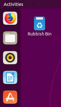
Looking at those screenshots, and given that Firefox appears at the top of the launcher, I think I should nick the exact blue gradient from the recycle bin.
But do we really want to keep the blue gradient from the recyle bin? Sounds really out of place to me…
3 Likes
My thinking was the blue on the Firefox icon mockup is “almost” identical to the blue on the bin, so I should try cloning it for maximum consistency (or maybe go the other way and make it less similar?). I can have a play and see what looks good when I’ve got my laptop 
Okay, the recycle bin gradient was too light when I tried it on the glyph version of the icon. Suggestion withdrawn!!
Here are the main options in contention, as I understand them to be:
Full icon on “white” (actually now a gradient of the two lightest Suru greys, @mr.tech ):
Glyph icon with Firefox colours, @madsrh:
Full icon on yellow with horizontal fold:

Full icon on orange with horizontal fold:
Full icon on the dark shade used for the iOS squircle, @eaglers:

My favourites are the first two. I think the iOS colour would have been best for maximum consistency with the brand elsewhere, if the colour had worked with the default launcher (and I think it’s too dark sadly).
I think the yellow/orange shades are quite nice, but it’s hard to pick a good (light) shade to go around a full colour logo that has maximum contrast at all points and looks nice. And we could spend forever faffing around with the gradients and fold to make them look nice and professional and consistent with Suru.
I think the “almost white” version looks fine and sets a great precedent that we could use for other third party icons (time allowing) while respecting their brands 100%. It’s basically just “manually masking” the icons into a shape like other UIs can do automatically. I would be happy to try to do the same for other major apps like GIMP if people wanted those doing as svgs in this style. Even if I just did one a week, we would have many tens of apps after a few months Also, it’s a simple task that other Inkscape users could help with, if we did a version of the Suru template with the off-white background?
Lastly, I think the blue/orange version with the fox glyph looks really nice. I’m quite pleased with the work I did bringing out the edges and contrast. However, even we chose that one, it’s the biggest departure from the established brand (effectively using the glyph as a starting point for a new flat version of the icon) and there’s a chance that Mozilla would prefer us to use the one with the full icon on a neutral white-ish background.
So, my two votes go for the white version, or the two colour glyph version. What does everyone else think? Also, happy to tweak any of the icons in response to feedback (e.g., if someone prefers the yellow version but thinks it should be lighter/darker/have a smaller logo, etc.).
3 Likes
There is a new/old problem that will occur with GNOME 3.30+ … I call it:
“Pathbar buttons vs stackswitcher buttons vs buttonbox buttons vs normal buttons vs text-buttons… inside the headerbar”
Currently we have the following groups (all are flat, so I leave “flat” out of this):

I just put the window controls on the list to not miss them but I think they are something special and do not need to be 100% consistent.
But the rest is pretty chaotic imho. Especially when we need a new pathbar styling in 19.4 .
To give you a little history why the previous orange underline design was “broken” in consistency:
-
We re-discovered/realized that the buttons in gnome-software are actually not a stackswitcher even if the function is the same (exchanging the content inside the window). We realized this because the container for those buttons is actually a “buttonbox”, which can also be used anywhere else in the headerbar (we’ve seen it only in the app “Glade” but it can happen everywhere else). So we needed a buttonbox styling for all possible occurences and ended up with this:

-
Nautilus 3.30 uses a new pathbar, which does not work with our current styling
@godlyranchdressing had a good idea for the pathbar and I really like it
But could we return one more time to the “drawing board” and find a solution for every type of button we have in the headerbar? In the end, all are buttons 
As you know I am not a big adwaita fan, but adwaita has 1 style for all (excluding window controls, like we do). (Edit: and excluding the new pathbar…)
@madsrh @luxamman @c-lobrano @jaggers if you have time it would be great if you could come up with something.
Edit 2: just for the record… this is the current stackswitcher button styling
2 Likes
Good recap, @frederik-f
Stachswitcher and buttonbox are similar to each other, they are basically special toggle-buttons
Pathbar is also the search bar in Nautilus 3.30, so it’s a toggle-button + entry
The three widgets differ by their active state:
- pathbar: bold font, since the background is always highlighted
- stachswitcher: orange underline, since the background is always highlighted
- buttonbox: background highlight
buttonbox has the most basic style, but is not enough for pathbar, since it is important to keep the full path highlighted
stackswitcher his always highlighted, but the orange underline is overkill in pathbar
pathbar style, the new one I mean, looks the more versatile. I believe it could look good for all three widgets
1 Like
Hm, we could also leave everything as it is, wait for gnome-software to use a stackswitcher, and try find a solution for the pathbar for 3.26 AND 3.30+
I really like the orange underline design 
Update: we fixed it by unifying stackswitcher and buttonbox styling
plus Having 1 look that works for nautilus 3.26 + 3.30 pathbar
1 Like
Could you make a PR with your LibreOffice and Firefox/Thundebird icons?
The “script-solution” by carlo is “on pause” right now if I understood him correctly
The automatic solution requires some more system work, yes. Eventually if you like the results I can provide the automatic generated icons (but I believe @jaggers results would be better :D)
Ah, apologies, I somehow missed these tags. Yep, I’ll do it tomorrow night
EDIT: I basically slowed down a bit on icons to see how the script solution played out, but if there’s a requirement for LO I’ll get back on them. Also I’ll do the PR for the server icon as well!
3 Likes
I’ll write a review about the icon-script later today, to let you all know the status and the current issues
2 Likes
Hi,
I wanted to write a short review of the surufy icon script. First thing first a bit of context:
the goal is to have a script that adds a suru style tile background to third party application icons when the application is installed (and remove it, when the app is uninstalled).
The script works fine (you can find it here), I am working now on the integration with the system, with both apt and snap.
what follows is thanks to @kenvandine support  (if there is something wrong, it’s just my fault in understanding it)
Apt (and snap, I believe) has a Post-Invoke hook, that let me call a script after apt install is called, which is the thing I need to launch the surufy script, however:
- surufy script writes new icons under
$HOME/.local/share/icons/Yaru, but apt runs as root, so it doesn’t know where user’s $HOME is. - the Post-Invoke script must be in
/etc/apt/apt.conf.d/, but snap package cannot install any file outside it’s containerized locations (e.g. /snap or $HOME/snap). As far as I know, there is no snap interface/slot we can use for this.
Solution:
- we could write directly where normal icons are installed, but I’m not 100% happy with this, first because if the user switches to a different icon set, those icons will stay in suru format and also because with snap we probably cannot write in icons folder
- the only solution here is to provide this surufy script as a deb package, with both the apt hook and the actual script. This means, however, that snap version would not have it.
another goal would be to execute the script ONLY on the last installed application.
4 Likes
Thanks for the work!
What if we
Inherit=Humanity,Full colour,Surufy
(In …/icons/Yaru/index)
And you put the icons only in a Surufy folder?
Then only our theme would use those
1 Like
This could work, but only for deb, otherwise the icons are provided by another snap gtk-common-theme and the location is again unwritable
@jaggers, could we try the folded background for the surufy script? Like the ones in https://github.com/ubuntu/yaru/pull/1015
Absolutely, I’ll finish the LO icons (I forgot Base) and then do some grey squircles with a fold in
1 Like
Thought I’d put something about the switch to single-svg-icons here, because it’s a bit too speculative to fill up Github PRs with.
To summarise for anyone who hasn’t looked at the Github thread: in future, Gnome (and icons designed to Gnome recommendations) will ship a single svg for >32px icons instead of multiple pngs optimised for the different sizes.
SVGs scale to some sizes better than others. For instance: if you divide your icon into different coloured thirds and scale it to 40px, the edges of the thirds won’t be 100% clear, because 40 doesn’t divide by 3. That means the boundaries will fall between pixels, leading to a bit of antialiasing (i.e., pixels that are midway between the two colours on either side).
Under the current system, we optimise icons for key sizes and ship the different versions, meaning that key sizes are as clear as they can be. But we can’t do that under the new system.
Gnome’s new guidance is to prove a single 128px svg optimised to be sharpest at 128px, 64px, and 32px. This presumably means that the designs are planned with a grid of 4px squares, where each square = 4px, 2px and 1px exactly at each of Gnome’s preferred sizes. So, boundaries and elements aligned to the grid won’t fall between pixels at those sizes, but will at other sizes. The largest Suru svgs are already designed in a similar way and scale well to similar sizes.
The most obvious thing for us to do is use the largest Suru svgs when we switch to the new system. One problem is Ubuntu’s current default launcher is 48px. The new Gnome icons, the most detailed Suru svgs, and the any third party icons designed to Gnome’s new guidelines won’t scale 100% well to this size. This isn’t a problem for us now because we make separate icons for the 48px size which are optimised to display very clearly at 48px, but that option is going away. So, the icons won’t look as nice as they do now unless we take action.
We’ve discussed the possibility of changing the default launcher size to 32px, to be more Gnome-friendly, but that’s not the only consideration here.
In our current Suru icon set, the squircles themselves and drop shadows are optimised for the different sizes. The full size icons have beautifully subtle edging and shadows that are sometimes lost at the smaller sizes.
The smaller icon sizes have highlights of exactly 1px at each size, which make the buttons stand out. Also, some designs have sharper drop shadows of 1px to make elements clearer. Unfortunately, when you scale the small icons up, those elements look too bold and cartoonish. So, using the full size icons and using the small icons both have disadvantages when we move to the new system.
Proposal: before we switch to shipping a single svg per icon as Gnome recommends, we create a new Suru template with slightly different style rules. This template will make sure that:
a) The icons look a bit better at 32px than the full size svgs would, but
b) They don’t look crude and cartoonish at larger sizes (i.e., no thick dark borders round the squircle).
This is a WIP, but I’ve started by trying to do a reconfigured version of the messaging app. So far it looks like this at the three sizes:


I’m trying to make this a hybrid style that softens the tradeoff in quality. The idea is to have a halfway house style that looks better than the full size icon at 32px, but also better than the 32px icon at 128px. At 32px, it already looks a tiny bit better than the full size icon (shown first) would:

Like I say it’s a WIP, and it isn’t yet a better alternative than just using the full size svg, but I’ll keep working on it and see what I can come up with. If we do change the default launcher size to 32px, it’ll be very important for the icons to look great at that size.
6 Likes