No probs @Carla, hope you like it!
Well, we’ve very nearly finished a non-squircle fork of the core Suru icon set. I thought that people who aren’t following Github might like to see what we’ve got so far.
Here’s a launcher showing a random mix of non-squircle Suru icons and third party icons. As you can see, the overall effect is less jarring than the squircle, squircle, squircle, random shape mix we had before.

Here are some screenshots of the shell showing loads and loads of non-squircle Suru icons, mixed in with third party icons. They’re not all perfect yet, but it’s in an advanced state of development as you can see:


And, like the original Suru icon set, each icon comes with five different svgs that are pixel-fitted for different sizes:


Hope you like it!
For info, I’ve applied the icons to a completely fresh installation. I’ve not added any apps or changed any settings. So, this is what the desktop would look like to a completely new user with the non-uniform Suru icons. Sadly I missed one icon on the second page of the app grid  so I’ll do that next.

I like it very much @jaggers, great job!
Latest screenshots of an (almost) clean install (plus Inkscape and GIMP):


Notes on this iteration:
-
The “A” symbol is sustained across software centre, properties and updater, at the same size and position in each icon;
-
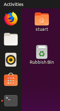
We’re working on the rubbish bin icon because it isn’t universally loved and doesn’t remind everyone of a bin - I currently have a blue pedal bin in that position because I haven’t been able to draw anything better;
-
All theme icons have now been de-squircled for the default installed apps, and the theme icons have been retired for (e.g.) Firefox.
It’s good to be internally consistent. Unfortunately, a larger issue is that the “A” symbol really shouldn’t be present in any of them!
This was an example of copying Apple and doing it badly. There’s no obvious reason for the icons to have an “A”, except that Apple’s App Store icons do. And Apple’s do because their App Stores were almost entirely (and, since macOS 10.14, are entirely) about applications. The “A” symbol originated on the macOS Applications folder.
But Software Updater and Software & Updates Settings are not even mostly about applications. Many, perhaps most of the updates provided through Software Updater — and even moreso, most of the packages you would control via Software & Updates Settings — are non-app packages: kernel, libraries, fonts, command-line utilities, themes etc.
On a separate note, I have to agree with Joey Sneddon: “Not quite sure why the ubuntu Software icon is now a lunchbox…” When something like a shopping bag has so few details to convey what it is, changing its shape is risky.
Hi @mpt, thanks for the feedback ![]()
This was an example of copying Apple and doing it badly.
Honestly, I’m not aware of the origin of this choice, I think I saw this icon since ages in Ubuntu, so much that I wondered if was imposed upstream (I know now it isn’t).
One could argue that the average user is not really aware of the difference between applications and libraries, fonts, etc., and that he/she can understand instead that these three softwares are “related-to-applications”, however I understand the general problem.
Personally, I don’t even know why there are 3 different softwares to handle all of this, and this overlapping of competences (again, from the point of view of an average user) makes complex to find a proper representation.
Let’s go on with this discussion though, since UI freeze is passed, we can provide something better for the next cycle (or even earlier during Disco lifecycle)
Just a note, I do not agree with the launch box argument, it is clearly a shopping bag to me (but I have seen only few launch boxes in my life :D)
I strongly disagree. We should not ask what those applications are working with (packages) but rather what the user uses them for.
Starting with gnome-software, the user uses it for installing applications.
Thus the A is simply the best fit until now, since a package is nowadays completely detached from a user’s brain (apps, apps apps!).
The user does not care for packages. The only package he wants are those from the postman.
An other alternative could be a circle of friends, which also makes not much sense since he does not install multiple instances of Ubuntu ON ubuntu.
He installs apps.
Software-properties-gtk on the other side are simply artifacts from a time where installing packages was a thing.
(software updater and software & updates)
There is already a trello card for integrating the functionalities of those two “Apps” into gnome-software.
Until then, let’s stay internally consistent.
Everything that is not an app should be abstracted to something like “System updates” and that abstraction should be used inside gnome-software
Must be because germans don’t use lunch bags, but I did not associate 1ms that it might be a lunch bag.
I bet @jaggers could surely improve it’s shape though - @eaglers was also not 100% happy with it on github
@mpt, @frederik-f, @c-lobrano:
Doesn’t address the “A” problem (which isn’t a step backwards at least!), but does this look more like a shopping bag:

??
I think the “problem” was only for the icon at small size, which doesn’t have enought details to show it’s a shopping bag. This version does not address this I think (even if it looks good, as the previous one, btw)
The A in the Mac App Store icon reflects the A in their Applications folder icon.
Similarly, the grid of dots in Gnome Software’s icon reflects the grid of dots in Gnome Shell’s apps menu.
The A in Ubuntu Software’s icon reflects … nothing in particular. It’s not consistent with the Ubuntu shell apps menu, and it’s not an initial of the app name.
Mostly agreed. However, here’s a new thing to consider … Eventually we’ll be promoting the Snap Store app for people on Linux OSes where the default store doesn’t provide snaps yet. For example, it’s not relevant to Ubuntu users because Ubuntu Software already provides snaps.
So, it would be cool if the Ubuntu Software icon and the Snap Store icon were obviously related somehow. Even better (though maybe not elegantly achievable) if it’s visually obvious that Ubuntu Software includes snaps while Snap Store has only snaps.
If so, that’s a bit out of date. Software & Updates Settings now contains settings I designed for Livepatch, which has nothing to do with apps. And soon it will contain settings for ESM too, since that’s another kind of update. Integrating updates into gnome-software was, I think, an example of Gnome copying Apple and doing it badly. And macOS has now split system updates back out of the App Store.
What’s so bad with having 1 or maybe 2 apps for updating everything on your system? Why would you want three dedicated apps for that?
On android you have the play store for updating your apk’s and the system settings for updating your system.
No idea about  , I don’t own a single product of them.
Even if Software-properties-gtk stays a dedicated thing, at least the naming needs a change.
Software updater and Software & updates are a bit of a vague naming.
You could name it “System updater” but it also updates apps if they come from repositories 
Maybe just “Updater”
I think the situation is a bit confusing for the user.
Changing the A on all three app icons to anything else won’t help here.
IMHO everything connected to installing or updating apps should be handled inside gnome software
“Eventually” turned out to be “tomorrow”. ![]() The Snap Store app is now promoted on snapcraft.io/store, so this issue is a little more important now.
The Snap Store app is now promoted on snapcraft.io/store, so this issue is a little more important now.
No idea! My view is that there should be one app for updating everything on your system: Software Updater.
If you meant “Why shouldn’t updates be in the app marketplace”, it’s because on a desktop OS, a window that large and distracting is the wrong application posture for a transient, and sometimes urgent, task like software updates. This is not an issue on Android or iOS, where most screens are much smaller, so almost every app has to be full-screen regardless of how transient the task.
And if you meant “Why is Software & Updates Settings a separate app?”, it’s because those settings alter what software is provided by Ubuntu Software, and Software Updater, and apt on the CLI, and Synaptic, or whatever other tools you use. (And that’s not even counting the settings for Livepatch and ESM.) Ideally it would be a gnome-control-center panel — but even if it was, it would still need its own icon.
I didn’t say the “A”s should be changed to make a situation less confusing (I’ve seen no evidence that it is confusing). I said the “A”s should be removed because there’s no obvious reason for them to be there in the first place. They are non-sequiturs.
Wow nice! If the snap store is a store app which only installs snaps, will gnome software still install both, debs and snaps?
I thought maybe we could combine those package-format icons on the gnome software store?
Like: some bag icon baseshape + snap bird + Debian logo + flatpak logo?
Yes! The Snap Store snap doesn’t have the backends needed to deal with debs/rpms, so will be snaps only. GNOME Software as installed on the desktop will deal with snaps and debs. It’s likely that the Snap Store snap will be ahead of the deb on features because it’s much easier to push out new versions of snaps than it is for debs.
(SRUs and what have you).
@mpt
Some article I found that somehow fits to this topic
it looks like Google wants to swap away from the Playstore=>apps, system settings=>system updates paradigm and release Android system updates via the play store:
As I said, for a mobile OS like Android, exactly where system updates are presented matters much less, because apps are full-screen regardless of their posture. And besides, as the article says, “Timely updates on Android is currently one of the biggest problems of the platform” — so if distributing system updates through the Play Store improves that, that’s more important than the complexity of the UI.
Meanwhile, I just remembered an idea I proposed way back in 2012 for the equivalent family of icons (which, then, included Ubuntu Software Center):
I suggested experimenting with the box metaphor currently used for Software Sources and Software Updater, with things that make the overall shape distinct. For example:
- USC could be a magic box, with applications flying out like they do from the current USC icon. http://www.google.com/search?q=magic+box&tbm=isch
- Software Sources could be the same box, but closed, with gearwheels or a spanner.
- Software Updater could be an airdrop, the box with a parachute.
Later, I sketched that last idea in the Software Updates spec:

I just saw this - I will try to think how an open/closed box could work in the current design style. Also, as this would be quite an advanced/intricate design, maybe the Ubuntu brand team could help us out…?
In the meantime, I’d been trying to simplify the “lunch box” and remove the “A”. For an apps symbol I was trying the app grid, but with each square in a palette colour for visual interest and to symbolise the diversity of the apps.
To try to de-lunch-boxify the bag I removed the semi-3D detail to return the focus to the standard Suru shape. Although the corners are still rounded in that case, these are ubiquitous in Yaru (e.g., paper document), so the hope was that the user would have some “theme blindness” to them and not interpret them as physical rounded corners when they were presented in the usual Yaru way without extra detail.
Also, I tried the handle as a curving string-style handle, because the square handle maybe reinforced the idea of luggage.
Attempt #1 at a magic box in Suru style looks a bit naff, but, like I say, this is a complex design that maybe I could use some help with, if it’s going to work:
