Overview
A contextual menu is a floating menu. It can be applied to any button, link or navigation item that requires a secondary menu.
Anatomy
The contextual menu is made of these different parts:
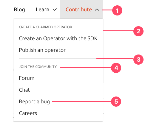
- Trigger (button, link or navigation item). Main element that requires a contextual menu.
- Menu floating box
- Divider (optional)
- Title for item’s group (optional)
- Selectionable menu item
Usage
When to use
- Use a contextual menu when there is a need for a secondary menu item that provides shortcuts for actions the user might want to take, without cluttering the interface.
- Aim for a small number of menu items
- Aim to place the most frequently used menu items where people are likely to focus first.
Make the order of items relevant - Follow best practices for using separators. As with other types of menus, you can use separators to group items in a context menu and help people scan the menu more quickly. You can also optionally use titles to group items together.
When not to use
- To provide advanced or rarely used items. Instead, it helps people quickly access the commands they are most likely to need in their current context
- In general, don’t use more than about three groups in a contextual menu
Behaviour
Open
Selecting (clicking) the main element that requires a secondary menu (button, link or navigation item) will open the contextual menu. It can be open by default.
Alignment
Using direction modifiers will change the placement of the drop-down menu. By default alignment is to the right of the parent pattern. It can be left or right aligned.
Hover
When you hover a selectable item in the contextual menu, it will have a hover state with grey colour.
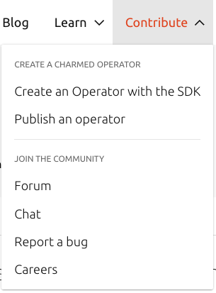
Example in Charmhub.io:

Click
When clicking on a selectable item in the contextual menu it performs the action.