Overview
The key/value component is used to list a number of values with their corresponding keys. It’s widely used when listing properties for a complex element or for a collection of similarly grouped elements (i.e. servers or subscriptions).
Anatomy
The component is made of a heading for the key that is on top and a paragraph text for the value that is under.
Usage
When to use
Use this component to organise information that requires grouping together a set of values and their keys.
When not to use
This component may not always address all requirements. For instance, when the user is required to scan the keys or the values of a long list of items, it is highly recommended to use the List component.
Variants
| Variant | Description |
|---|---|
| Vertical stack | 2-line key/value pair |
| Horizontal stack | 2-line key/value pairs displayed in columns |
Vertical stack
Definition
This variant stacks vertically the pair of a key and its value.
Values in this variant can be wrapped into more than 2 lines.
The look

Usage
When to use
Use this variant when you have one or more of the following constraints:
- the width is too narrow to show columns
- you have long keys (that would wrap in columns)
- You have long values that can’t be wrapped or truncated (e.g. Mac address)
when not to use (and recommandations)
Don’t use this variant when you have one or more of the following constraints:
- the width is big enough to show the ‘rack columns’ variant
- there is a long list of items, use the existing ‘list’ pattern (left aligned keys by default), with a divider when you have a mix of long and short labels
- the user needs to quickly scan keys of values only, use the existing ‘list’ pattern (left aligned keys by default), with a divider when you have a mix of long and short labels
- the user needs to be able to compare values, use a table or a list.
- The keys are short (they don’t wrap in columns) with short values. In this case it’s preferable to use a horizontal stack.
Behaviours
- The ‘rack’ variant is static and doesn’t have any hover or click behaviour.
- Its text can be selected and copied as any other text.
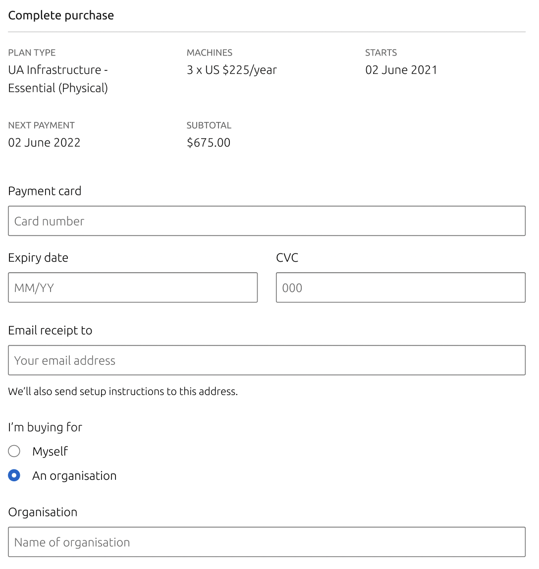
Example
UA Purchase

Horizontal stack
Definition
The horizontal stack variant expands horizontally the key/value pair.
It can be extended into 2 or more columns according to the available space.
Values in this variant can’t be wrapped in more than 2 lines.
If values are longer than 2 lines, we recommend to use the vertical rack variant or truncate the end of the value with ‘…’
The look

Usage
When to use
This is the default variant when the layout doesn’t show values that wrap into more than 2 rows. Use this variant when you have one or more of the following constraints:
- the width is big enough to show columns: Use the same logic than grids to split into columns
- you have short keys (that don’t wrap in columns) and short values ( or that can be wrapped and truncated into 2 lines maximum)
when not to use (and recommandations)
Don’t use this variant when you have one or more of the following constraints:
- the width is two narrow to show columns
- the keys are long(that would wrap in columns)
- values are long or can’t be wrapped and truncated into 2 lines maximum
- the list of items is long
then use the existing ‘list’ pattern (left aligned keys by default), with a divider when you have a mix of long and short labels - the user needs to quickly scan keys of values only
then use the existing ‘list’ pattern (left aligned keys by default), with a divider when you have a mix of long and short labels - you need to compare values. In this case it’s preferable to use a table or a List view with left aligned keys/Values
Behaviours
- The ‘rack column’ variant is static and doesn’t have any hover or click behaviour.
- Its text can be selected and copied as any other text.
- Use line-wrapping when using longer value strings so the width of all similar components in one view is equal.
- The number of columns can vary according to the width of the area, the device and the sizes of keys and values.
- All columns should have the same width.
- It will follow the responsive behaviour of grids. When it wraps, there is less column and more pairs will stack per column.