Coming to Ubuntu Studio 26.04 LTS: Three Layouts. Help Us Pick The Default!

Xfce Legacy

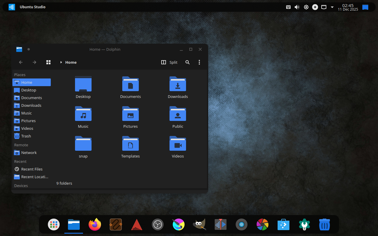
A lot of people have asked us why Ubuntu Studio comes with a panel on top as the default. For that, it’s a simple answer: Legacy.

When Ubuntu Studio 12.04 LTS (Precise Pangolin) released over 13 years ago, it was released with a top panel by default as that was the default for our desktop envirionment: Xfce.

Fast-forward eight years to 20.10 and Xfce was no longer our default desktop environment: we had switched to KDE’s Plasma Desktop. Plasma has a bottom panel by default, similar to Windows. However, to ease the transition for our long-time users, we kept the panel on top by default, resizing it to be similar to the default top panel of Xfce.

A macOS-Like Layout

With 25.10’s release, we included an additional layout: two panels. One panel is on top with a global menu, and the bottom contains some default applications, a trash can, and a full-screen application launcher. This is a way to feel familiar to those with a similar layout from where they may be coming from, being an operating system for creativity: macOS.

Familiarity and Traditionalism: Windows-like Layout

Starting with 26.04 LTS, we’ll also include one more layout: a bottom, Windows 10-like layout. This is to ease the transition for those coming from Windows, and due to popular request and reports.

Should We Change The Default?

It has been 13 years since we defaulted to a top panel, but is that the right idea anymore?

Right now we have a poll to decide if we should change the default layout starting with 26.04 LTS. This will not affect layouts for anyone upgrading from a prior release, but only new installations or new users going forward.

  • Keep the Xfce-like top panel layout
  • Switch to the macOS-like dual panel layout
  • Switch to the Windows-like bottom panel layout
0 voters

Poll closes at 16:00 UTC on December 26th.

12 Likes

A post was split to a new topic: Accessibility in Ubuntu Studio

I myself really appreciate the quick layout options, but I’d keep the default top-panel (XFCE-like) panel layout as default. That’s probably out of habit (been using Ubuntu Studio since 2011), but I also find it the most flexible option.

Of course, it’s horses for courses, so others might have other preferences. Of these, maybe the WIndows-like layout will be a sensible option, considering we’re on the eve of a wave of users moving away from the Windows 11 debacle and considering other options; they’d find the Windows-like layout more familiar (and the rest of us, of course, will have no problem switching and configuring layouts as we like them).

6 Likes

Exactly. As you can see here:

No matter the outcome, it doesn’t affect existing upgrading users. We’re not going to overwrite your ~/.config directory. :grin:

8 Likes

I wonder what the UX philosophy is for top/bottom bars? It seems like there’s an intentional decision to put it somewhere:

  • Windows 95-11 are bottom, and 11 initially launched with no ability to move it to sides/top (implying Windows UX keeps it at the bottom for a reason?)
  • macOS and GNOME have a system bar on top, but no traditional window taskbar (implying showing those at all might not be ideal on top?)

Could it have to do with eye position vs screen position? Mine’s currently wall-mounted and the bottom of the screen is eye-level (I have to glance up a little to see the top bar). Typical office monitors on the same level as keyboard/mouse on a desk might have the top of the screen eye-level (needing to glance downward for bottom-bar). I guess depending on what bars are used for, it could affect eye fatigue?


With the 3 screenshots, I like the first two (seems odd with the bar on bottom), but the right blue box is odd depending on what it does (if it’s minimize everything/show desktop, that needs to be tiny/more hidden; Windows has a tiny sliver of a bar for that; if it’s workplace switch it should be swapped other side of clock imo, maybe integrated on notification bar).

I like the 2nd screenshot the most! The blue box being present makes the last screenshot look better though.

1 Like

It’s a minimize everything/show desktop button. Its size is relative to the size of the panel bar, so changing its size individually is not something that can be done.

1 Like

Well done as always just to open this to the community for discussion.

I’m part of the “wave” that’s moved off Windows 10 to Ubuntu Studio as a daily driver. Currently running 24.04.3 LTS with the (very infrequent) dual-boot to Win 10. It’s been more than a year since I made the move, but I’ve been a KDE/Plasma devotee going back to the 3.x days. Personally I prefer the Windows-like taskbar at the bottom. As long as it’s configurable, for me the default doesn’t really matter. And I really like the approach of not changing the configuration for those of us who will (eventually) upgrade to 26.04.

1 Like

Hopefully the upgrade will go smoothly to 26.04 when 26.04.1 is released in August and upgrades are turned-on. Of course, we’ll be testing, but you’re looking at a whole-version Desktop Environment upgrade from Plasma 5 to Plasma 6 at that point. If the upgrade from 24.04 to 24.10 was any indication, this shouldn’t be an issue at all.

The only issue that might be interesting is that we also switched themes from Materia (which is currently dead upstream) to Orchis: Materia’s spiritual successor. Roughly the same theme but with rounded corners.

One of the cool things that you can do with Plasma is keep the layout while changing the appearance settings:

Of course, that only works half-way as the Kvantum theme will have to be changed in Kvantum Manager:

Honestly, it’s a minor inconvenience and doesn’t affect functionality at the end of the day, but again, we’re not touching your layout. You can, honestly, make it whatever you want!

2 Likes

Which is, at its deepest core, the reason I’ve been using KDE for the last 20 years.

1 Like

The Windows-like layout is very nice, also i think you should add an arm64 version. But please keep the legacy theme and macOS theme as well.

RE: WIN11 bottom-only taskbar. Relocating the taskbar breaks MS Copilot, or whatever their calling their mandatory AI these days. That’s why they locked the taskbar in place with a mandatory “Security” update.

I like the top bar visually, but couldn’t that be handled as a Theme Package? Like, if you prefer the current layout, just apply the Studio 24.04 Theme after the upgrade?

Yes:

We have three layouts each with dark and light variants. The poll is just to choose the default.

1 Like

They didn’t have the option to move the taskbar since beta/launch (before Copilot was a thought iirc), but they added an option to hide the clock in taskbar before the ability to move the bar making me think they really prefer the bar on bottom :stuck_out_tongue:

I’m not sure if the taskbar can be moved officially, but if it can’t be moved officially then Copilot not working could be a lack-of testing/unintentional.

1 Like

The people have spoken. BUT this only changes the default and the other layouts will be available as stated in my previous replies above. Additionally, it won’t change for existing users, including upgrades. As stated before:

Pro tip: Make sure you read the whole thread to understand this.

3 Likes

Looking forward to this. I like the idea of the Win-10 theme. But I don’t mind the default xfce-esque theme either. I’ll probably switch to the new default, but that’s just me. I didn’t find this thread until after the poll had closed.

Windows-like bottom panel layout please