Call for participation: an ubuntu default theme lead by the community?

I’ve notice an issue at the top left . It seems to be a gap .
The ubuntu show activities button border seems of centre.
And i think Squircle high lights in the ubuntu dock would suit the theme better and be more consistent.


The gap is only on the community session . and a compared shot of squircles .
Sorry im being picky . I do prefer softer look of a line under the highlighted categories in the top activities bar and the orange over the light grey of the open window . If the grey were thinner it might have better eye appeal .

The top right corner icons are suru icons . Can it be raised with the creator or maintainer ?

I am in the squircle dock highlights boat :slight_smile:

1 Like

Maybe a bit too early, are we going to see a light version as well ?

This should have been fixed already

1 Like

Can I float an idea?
I think the Ubuntu application button would look great as more of a watermark on a button rather than the hard solid look it currently has .
What do people think ?

2 Likes

@jasonflindt

Yep, I think that could be less intrusive. Maybe achieved by simply introducing some opacity?

watermark ubuntu logo

2 Likes

That looks horrible. Makes it appear as if it is just a watermark/overlay - and hides the fact that it is a button. Please don’t use this. The current black square with the white logo, whilst not perfect, is better than this.

3 Likes

@CraigD - the problem I personally have with the current black square is:

  • A bit too stark/visually intrusive;
  • The hover highlight is ever-so-slightly smaller than the black square, which looks a bit unfinished/untidy IMO:

show apps

Tbh I think I just like the vanilla Gnome button (3 x 3 dots) more than I like an Ubuntu logo here!

2 Likes

Okay, I’ve been having a look at the latest PPA version of the Communitheme. Here’s my latest feedback.

The shell. This might be an unpopular opinion, and I don’t want to denigrate anyone’s efforts - but I just don’t want my lovely 17.10 shell to change much.

Every time I return to it, it makes a great first impression. It feels clean, airy, and fresh. I think the 17.10 designers did a great job here. If it ain’t broke… don’t fix it? All I’d like to change is for the top bar to go a suitable (flat) shade of grey when a window is maximised.

I think I would even like to keep the standard “show apps” icon (3 x 3 dots) because it’s smart and unobtrusive, and I haven’t seen a version with the Ubuntu logo that I like better yet. But I also quite like @jasonflindt’s idea of a watermark-style logo.

The icons. One thing I always liked about Ubuntu Phone (I actually had one!) was how colourful the launcher looked. So I was really pleased that everyone agreed to use Suru. However, the reality isn’t matching my hopes yet. Only a handful of system apps get the Suru look, and some of the most common ones (settings, terminal, files?) are monochrome.

I’ve said this before, but I honestly think it would make a huuuuuge difference if we superimposed other icons on Suru squircles. Could this be automated? I’m imagining a batch process that takes each of the non-Suru icons, shrinks it a bit, and centres it on (say) thirty-two pre-coloured squircles in different shades. Then someone simply has to pick the most pleasing one for each app.

For instance - no creative energy or thought was expended on the following mockups. The current icons were simply shrunk a bit and stuck on squircles. If I can do it, I feel like a script could?

suru 3rd party icons

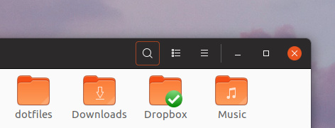
Also, is there a reason to make common Suru icons monochrome? I feel like we can introduce a bit more colour by making the terminal and files icons mirror the default Ubuntu theming, which has purple/green/white for the terminal and orange for folder icons. Something like a more polished version of:

coloured icons

Of course, one man’s meat is another man’s poison, and others might feel this is gaudy. IMO it’s more in keeping with some of the other Suru icons.

4 Likes

Can’t we use border-bottom here as well ?

nautilus pop up 1x

Personally, I am all in for keeping breadcrumbs with a single element style. Keep it simple, please.

a sharper image can be obtained if the effect of 1px box shadow in window decoration is removed.

box-shadow: 0 3px 9px 1px rgba(0, 0, 0, 0.5), 0 0 0 1px rgba(0, 0, 0, 0.23);

to

box-shadow: 0 3px 9px 0 rgba(0, 0, 0, 0.5);

removed

or a new color is needed between the shadow and the title bar.

2 Likes

Nice . I like that .

Personally, not a fan of a full orange highlight for buttons, too much distraction. A silent highlight like #000 or similar shades would be better, in my opinion

2 Likes

Inspired by the post slider here in the forum, I have trimmed the height of unhighlighted part in the buttons

nautilus pop up 2x

I agree! The best looking is definitely the silent “highlight” (as you call it). I was merely pointing out the inconsistency of it all.

2 Likes

I do agree @feich that it looks sharper, but I believe the issue is overlapping windows. Like this:

6 Likes

This and #000 . I like #000 more though :slight_smile:

2 Likes

Currently, we’re using border-bottom for some selected items (like the current folder in path-bar), while these are just buttons you can click on to perform an action (or are disabled)

1 Like

The underlying (inactive) Window do not pose a problem because their colors are dimmed.
If you are having problems with hdpi screens. Increase the shade a little.
box-shadow: 0 3px 9px 0 rgba(0, 0, 0, 0.75);

And it can be useful to use #474747 instead of #363636 for inactive windows.

1 Like