I’m starting this topic because there are certain components in Ubuntu that are different from upstream gnome so they could need downstream design and the one big design thread includes a lot of discussion from the early days.
(For example the Yaru theme suite, dash to dock extension or the indicator extension are downstream additions that could need further design.)
Would be great if @madsrh@c-lobrano@jaggers@mpt@willcooke@seb128@3v1n0@luxamman or anyone else from the desktop or design team could insert wishes and ideas in here and we see if we can implement them with the help of the desktop team or people with better knowledge of gtk and gnome shell than me.
Hey there all,
some thoughts and ideas from my point of view.
Seems we are dropping the original (mixed) Yaru and the bright one is getting the new Yaru and we are shipping a dark variation, too.
Also, the code is thanks to the developers (as I know @c-lobrano and @frederik-f) now much closer to Adwaita (because they also worked directly in Gnome upstream and rebootet Yaru on that base) and is now hopefully more easy to maintain.
After some time investigating and trying, I would like to suggest a few points for now to talk about to bring especially the dark variation closer to the ordinary, none professional people (without having to install “Tweaks” and so on).
Renaming the (Ubuntu only) settings “Dock” to “Design & Dock” and put a drop-down menu into that settings, to give the user the power, to switch between all Yaru and Adwaita variations. Also asked @didrocks.
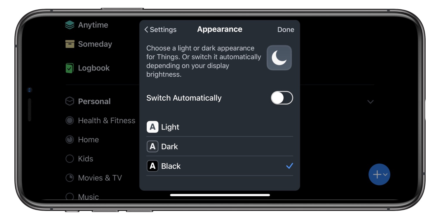
Connect the theming to the “Nightlight” settings. So you can choose a theme (like Yaru dark) or it automatically finds the dark variation of your theme (its only a “-dark” after Yaru or Adwaita) and switches (if you want to) the theme when switching nightlight on/off. This may need work in Gnome directly, but would be a great addition to nightlight.
I will have a closer look at the actual design, for now just the following things are in my mind:
The dock is too transparent - especially when in max-window mode
This point has been discussed at the last GUADEC indeed, proposed by elementary OS developer Cassidy Blaede (this post is the beginning of his research). It’s more a technical problem, I agree it would be good to have such option.
There’s also a gnome-extension - under test - to simplify the switch. The “problem” for this switch to work is that not all themes have the same behavior regarding variants. Some have normal and “-dark” variant, but it’s not common and the switch shall work for any installed theme. At GUADEC has been proposed to consider the “-dark” appendix the canonical name of a dark variant, or to add some more metadata to the themes to specifiy whether it’s a normal theme or dark. Not sure when this discussion will continue though, probably at the next conference unfortunately.
Without the automatic change from opaque to transparent, due to recent gtk changes, the full dark dock was really too heavy. Currently, the transparency is set to 70%, which is barely noticeable with dark wallpaper sometimes. Do you have in mind a different value to propose?
Hard to say without be able to test… maybe just 75% or 80% to be a little darker. It’s maybe a personal thing, so the wallpaper is not getting too much through the dock when in fullscreen - with certain wallpapers it just looks not that nice… IMHO - other opinions/testing welcome!
Since the Dock settings are only present in Ubuntu, we maybe can think about implementing that. Robert Ancell seems to be the one to ask - @robert.ancell what is you opinion? Is it possible to bring a dropdown to the settings to give the dark-mode and theming a better base for ordinary people?
This could be a quick design mockup with even more handy settings found in the “Tweak tool”, so no big changes technically but giving the user little more selection options.
I don’t know which parts of this are new, so please excuse any comments on things you haven’t changed.
There’s probably no good name for this category, as long as it contains such highly unrelated things as UI theme, battery percentage (better in “Power” or more complete Top Bar settings), and calendar week numbers (better in “Date & Time” or the calendar itself). But “Design” covers much more than what’s in here, and “Details” clashes with the category that is already (unhelpfully) called “Details”.
Windows splits roughly-equivalent settings across “Colors”, “Themes”, “Taskbar”, and “Select which icons appear on the taskbar”, while macOS splits them across “General”, “Dock”, and individual status menus. Splitting out launcher settings into a separate panel (as we planned for Unity 8) would be one step to untangling this, and it would make room to show thumbnails of each theme option.
Show thumbnails of each theme option. (This is even more important since “Yaru” will not mean anything to most people.)
“Auto-hide the Dock” and “The [D]ock hides when any windows overlap with it” could be simplified into “Auto-hide the Dock when any windows overlap it”.
Even without any reorganisation, there’s plenty of room to make the launcher position options clearer by using radio buttons (or a segmented button) rather than a radio menu.
It’s not necessary to say “Switch animations on/off” when I can see that it’s a switch. Just “Animations” would be fine.
“Switch off on low[-]end devices for better performance” would be much more helpful personalised. Is my device a low-end device, or not?
I don’t understand why any of the other settings in this screen use switches rather than checkboxes — but that aside, the “Details” switches should be aligned with all the controls above.
Seems my “quick design mockup” wasn’t good enough^^
I didn’t want to make things too complicated and I thought, that this is the only place in the settings the Ubuntu team can/will/would change. Sure it would be also possible to to divide it into the existing settings.
So let’s try again with maybe… “Personalize”?
And I’m not a native English and I also don’t know what is possible - that’s why I reach out to you all.
But: since I also designed the Yaru icon, here is a little update:
I think those thumbnails are really the way to go. Great mock-up! @mpt is right about this. What’s a Yaru? What’s a Y?
I think instead of having those radio bullet buttons, you could try to play with a linked box of three buttons or even thumbnails or symbolic icons again for the position of the dock
This mockup looks great! The thumbs is much more explanatory than the light, dark, darker, mixed, Yetti, Yaru, Amibiance labels
So +1 for a great and user friendly experience with this suggestion, but the issue I see with this, is how it technically would be implemented
We (as in Ubuntu) would need to carry a patch for this. The Canonical guys will know if that’s something they want to do (@robert.ancell or @willcooke ?), but what happens when I select another theme in Tweaks (Arc, Adapta, Adwaita…)? Does this section disappear/disable?
The best and very longterm goal, would IMHO be to add a standard specification to the index.theme in the theme folder - in collaboration with upstream (Freedesktop?) - where we could define if the theme is a light, dark or mixed theme and in the same folder provide a thumbnail.
At the moment there is no way for the software to detect if theme is light or dark or if any variants exist. So a standard would be great. I know that there has been some talk about this related to the “night light” discussion somewhere upstream.
I am always a big advocate for working upstreaming, but since Gnome don’t really want to support other themes I think just carrying a patch would be easier
I love the thumbnails but they have to be tailored to the individual theme, so perhaps a more universal solution would be to use symbolic icons like this or this
This has been discussed at GUADEC
Currently, the best option is to expect a “-dark” appendix for dark variants, but you’re right that the specification should be defined at FreeDesktop level (see also: https://www.youtube.com/watch?v=gi_3b81eBUE)
Also this whole gnome settings panel “Dock” is currently Ubuntu only,
so I see no problem with improving this panel for the Ubuntu desktop.
If the upstream development concerning the global dark and light modes/toggles looks promising at some point, it can still be dropped in Ubuntu if wanted.
“Theme” + “You can choose the look of your Ubuntu system” could be merged and made more specific: something like “Theme for windows and controls”. (It doesn’t alter your background picture, for example, which OS themes sometimes do.)
One thing still puzzling is the “Use Hot Corner” option, because it’s not clear what the off state means. (That is, how do I invoke Activities when it’s turned off?) But maybe that’s outside the scope of this discussion.


