Mockups/new design discussions

I thought the sky blue version looked pretty good on my laptop but a bit naff when I look at this thread in my phone

I had the same impression. Also @madsrh mockup looks good, but less crisp than others, but maybe it is just because it does not have the same fold effect, or because it’s a screenshoot

1 Like

How about the dark shade but with a larger logo, so the icon doesn’t look so dark on the launcher?

image

EDIT: I’ve tried that on my laptop and my phone and I think it looks all right.

I also like the idea of the flat orange glyph on the blue background. I note that the Firefox style guide also describes the glyph as the “one colour icon”, so the danger is they only envisaged it being used in a monochrome design where maximum simplicity is required. When they use it themselves it’s like that. By using both colours we’re arguably inching towards recreating a flat version of the full logo, which is what we’d probably do if we had free rein :slight_smile: To make it crisp we might need a drop shadow and possibly a top edge highlight on the fox to make it stand out on the blue, and I guess then we’re just a small step away from sticking a blue circle behind the fox :slight_smile: That would be lovely if done well (a “paper” version of the full Firefox logo) but Mozilla might say the glyph is for when you can’t have blue and orange, use the normal icon if you want a full colour version that emphasises “this is Firefox”, etc…

2 Likes

The squircle background is so dark that it looks like a normal firefox icon :smiley:

How about a blue that has a bit of a gradient, so it’s darker behind the yellow and lighter behind the red for maximum contrast at all points of the logo:

image

EDIT: Same gradient approach with two shades of Suru grey:

image

1 Like

I’ve tried to do the grey version with crisper edges on the logo:

image

EDIT: Still trying to make the grey version as sharp as possible, the upload degrades the image quality though which affects this icon quite a bit:

image

Okay, I’m still chipping away at the full logo on a squircle. I’m currently using Suru grey but the refinements could be used for any colour.

What I’ve been doing is making very microscopic changes to the svg to optimise it for 48x48. I don’t believe these are trademark violations because they’re sub-pixel, and I think you could introduce equally big changes if you exported the svg from a different app that averaged the pixels out slightly differently. There’s also a slight drop shadow to make the yellow tail more distinct and the opposite on the other side to make the red edge sharper.

image

image

Also, looking at screenshots of 12.04 which inspired the LibreOffice icons, I note that Firefox has an orange squircle:

image

So maybe one of the lighter shades for orange on the Suru palette would work here:

image

3 Likes

Orange with Suru fold:

image

2 Likes

I like Suru yellow behind the logo, but it helps to have a fold to lighten the top right corner so the tail doesn’t melt into it:

image

EDIT: This might look a bit more balanced if the fold cuts the squircle in half:

image

EDIT #2: You know what, lol… I rejected white at the start because it made the scaled logo look ugly (pixellated) around the edges. But when I revisit it now with the newly scaled logo, I think it’s definitely an option:

image

In fact, if someone held a gun to my head and said I had to choose one tonight, I’d say white.

4 Likes

I like this, I only expected to see an horizontal fold, like the libreoffice one, what do you think?

2 Likes

Yes, I’ll try non-diagonal folds tonight in yellow and orange. @madsrh is your preference for the orange glyph on the blue background? If so I can do svgs of that too :slight_smile:

1 Like

Attempts to do yellow and orange with horizontal folds:

image

1 Like

@madsrh’s idea looks great with some edging/gradients to make the glyph stand out:

image

EDIT: We might need to tweak the shade of blue but this one is my favourite, if it’s not a trademark problem!

3 Likes

This very slightly different version uses a Suru blue:

image

EDIT: Bottom half can be darker rather than lighter:

image

3 Likes

It might be helpful to see all the mockup close together to make a choice

2 Likes

I’m travelling tonight/tomorrow day but will put them together either tomorrow night or Thursday night

1 Like

Looking at those screenshots, and given that Firefox appears at the top of the launcher, I think I should nick the exact blue gradient from the recycle bin.

But do we really want to keep the blue gradient from the recyle bin? Sounds really out of place to me…

3 Likes

My thinking was the blue on the Firefox icon mockup is “almost” identical to the blue on the bin, so I should try cloning it for maximum consistency (or maybe go the other way and make it less similar?). I can have a play and see what looks good when I’ve got my laptop :slight_smile:

Okay, the recycle bin gradient was too light when I tried it on the glyph version of the icon. Suggestion withdrawn!!

Here are the main options in contention, as I understand them to be:

Full icon on “white” (actually now a gradient of the two lightest Suru greys, @mr.tech ):
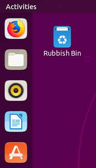
image

Glyph icon with Firefox colours, @madsrh:
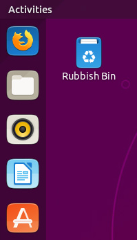
image

Full icon on yellow with horizontal fold:

image

Full icon on orange with horizontal fold:
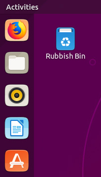
image

Full icon on the dark shade used for the iOS squircle, @eaglers:

image

My favourites are the first two. I think the iOS colour would have been best for maximum consistency with the brand elsewhere, if the colour had worked with the default launcher (and I think it’s too dark sadly).

I think the yellow/orange shades are quite nice, but it’s hard to pick a good (light) shade to go around a full colour logo that has maximum contrast at all points and looks nice. And we could spend forever faffing around with the gradients and fold to make them look nice and professional and consistent with Suru.

I think the “almost white” version looks fine and sets a great precedent that we could use for other third party icons (time allowing) while respecting their brands 100%. It’s basically just “manually masking” the icons into a shape like other UIs can do automatically. I would be happy to try to do the same for other major apps like GIMP if people wanted those doing as svgs in this style. Even if I just did one a week, we would have many tens of apps after a few months :slight_smile: Also, it’s a simple task that other Inkscape users could help with, if we did a version of the Suru template with the off-white background?

Lastly, I think the blue/orange version with the fox glyph looks really nice. I’m quite pleased with the work I did bringing out the edges and contrast. However, even we chose that one, it’s the biggest departure from the established brand (effectively using the glyph as a starting point for a new flat version of the icon) and there’s a chance that Mozilla would prefer us to use the one with the full icon on a neutral white-ish background.

So, my two votes go for the white version, or the two colour glyph version. What does everyone else think? Also, happy to tweak any of the icons in response to feedback (e.g., if someone prefers the yellow version but thinks it should be lighter/darker/have a smaller logo, etc.).

3 Likes