Overview
A switch is a control that toggles the state of an item ON or OFF.
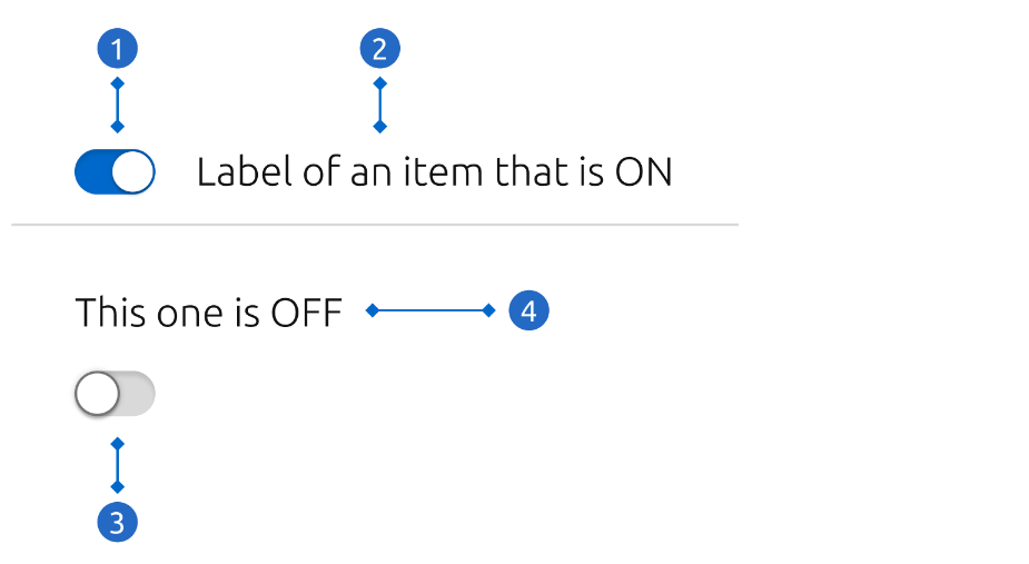
Anatomy
-
Switch control ON
When the switch is turned ON, the background turns blue and the handler moves to the right side. This happens in any action event on the whole component (either the switch or its label). -
Inline label
This option works better in isolation or in smaller forms. If a large form is using only labels on top, consider keeping it consistent with the block label. -
Switch control OFF
When the switch is turned OFF, the background turns grey and the handler moves to the left side. -
Block label
The label takes the whole width of the parent container, like text input labels. This option helps keeping consistency in situations where all the components have their labels on top.
Usage
When to use
Switches are only used for binary actions, especially when they occur immediately after the user “flips the switch”. They are commonly used as “on/off” form controls.
When not to use
- Choosing options → use checkboxes instead.
- Exclusive choices that cannot be explained simply as “ON / OFF” → use radio buttons instead.
- Irreversible actions → if switching results in an irreversible change or the component must be disabled afterwards, consider using an action button.