@madsrh Please don’t use radius in folder highlighting. Not exactly what we are trying to do
Otherwise, no match 
@madsrh Please don’t use radius in folder highlighting. Not exactly what we are trying to do
Otherwise, no match
Do you mean the orange square with round edges in the sidebar? I was simply trying to stay consistent with round edges for that, window and tabs.
Anyway, the rounded window concept have been killed (Mockups/new design discussions - #51 by wfpaisa - Theme Refresh - Ubuntu Community Hub) 
Yes.
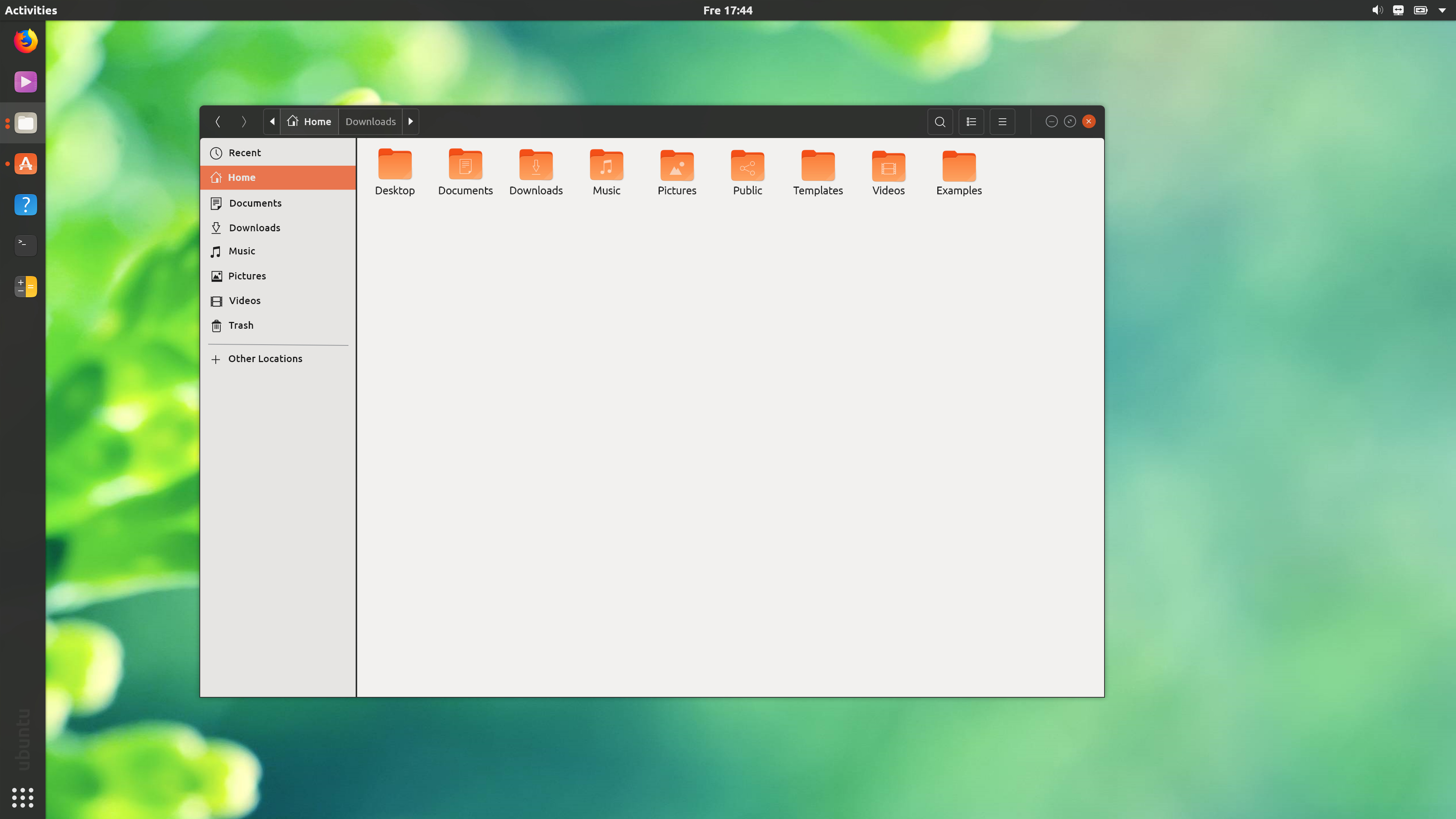
Can’t we match border radius at the bottom left section ? No CSS work around possible ?
I have no idea. Did you the reply wfpaisa posted? Perhaps he can elaborate
You can, but it won’t be reliable and “just work” for every program.
Window corners can be rounded just fine. The problem comes when a a widget overlaps and draws over where the corner is rounded. @wfpaisa explains it here.
Looks like a good direction to go about it. remind me DTD extention 
I think that design has a bit too much clutter, especially since the idea behind icon masking was to make everything more unified. This makes the difference between icons stand out even more…
So, my logic for colored options would be:
So in the case of the login button, this is the preferred button, so make it green but there’s no need to make the cancel button red because it’s not destructive. I think this is already possible with Gnome, I think buttons have a property that tells you if the action is preferred or destructive. If none of the above apply, make it a normal, non-colored option.
Login is a preferred option ? :neutral_tone:
That too is a non-destructive choice we should leave to the user, right ? Not something like " save " .
This (1) scheme would work just fine for now
After a year or two, I am sure this (2) will last.
Let’s go flat for now 
Box radius is also a bit too much in (2)
Ref : Mockups/new design discussions - #63 by godlyranchdressing - Theme Refresh - Ubuntu Community Hub
Actually, this is the current default with Ambiance in 17.10. (FTR, it’s name suggested actions instead of preferred).
So as @didrocks points out, the actual name in Gnome is “suggested action”:
@meetdilip, in my explanation I only mention “destructive” for red buttons. Green should be the action that the app developer or the OS developer suggests you click on in 99% of the cases. This gives the user an additional confirmation that what he is doing is “correct”. It’s ok to press the green button since that will “do the right thing” in 99% of the cases. For the login screen, 99% of the cases, a user wants to login.
@didrocks, is there any notion of a “destructive” action in Gnome? Either “an action you should not do” of “a dangerous action”?
I actually think the first example is a lot more user-friendly. Option one clearly shows that the button is associated with the textbox. This isn’t clear anymore in option 2.
Flat is good, but let’s not throw away years of improvements of subtle UX hints…
Yes, and they are currently red in Ambiance.
Not making an argument, what if I am sitting in front of a locked screen of an office machine, or another home machine. Ubuntu need not further fuel my curiosity in trying passwords on the login screen. Wife’s name, child’s name etc of the machine owner. A locked screen is locked for various reasons. It could be due to privacy in presence of an outsider. A developer need not have to suggest that the PC should be unlocked.
Just my opinion.
Maybe, my main objection was how box-radius is used in the first image. The radius was a bit too high for my liking.
(1)
Purple and black widgets are not doing great together. A semi-transparent login widget with the purple background would have been great.
Also, these are the days of round avatars
(2)
I used to like breadcrumbs more when it had border-bottom or border-top
To get to this screen, the user must’ve already removed the “lock screen shield” by pulling it or pressing enter.
Apple’s design also has very difficult to see hairline-thin icons are a a big loss to usability. While it’s very beautiful, it’s been slammed repeatedly for being a UX disaster. Having a usable UI is one of the constraints of this design, and design without constraints is just art.
The black fine line gown down along Nautilus window, between the shortcuts and the suru icons, is not that pretty. It look like a bit W95 in a way!