The theory makes sense yes but the min and max are not consistent in that they would need their own little circular buttons too. Just a thought 
5 Likes
@madsrh Does a new mockup exist that show us in which direction the theme is heading? If there is not a final mockup the rest of the community will stay confused and will always throw ideas at the communitheme-team which they don’t want or already discussed. I think it is important that we now in which direction this is heading.
I think the square does look better tbh 
2 Likes
There’s no new mockups. If there are changes suggested / planed, they are “mockuped” (if that’s a word) in the issues on github. Was that what you meant with “…which direction the theme is heading”?
The community should IMO throw ideas - perhaps not at us directly, but here for discussion.
I know, but that’s the case everytime we use orange. If you backlog the conversation (it might have been an old issue on github) you’ll see that we decided to keep the orange (like in the sidebar).
2 Likes
But wouldnt that mean the theme will never be really finished because there is no fixed target? We could try different ideas forever.
EDIT: I mean it should be clear how the theme will look like when it is finished. A target, a goal, a destination. Or else we have hundreds of different imaginations of the theme in every head of a community-member. I do not think that would work. At least it slows the development down.
Okay that makes sense.
In the end closing an application is a decision to make
Would it not be a constantly ongoing/evolving thing over the lifetime of Ubuntu? Just like any other OS.
Not sure if other OS have a constantly ongoing/evolving theme. Windows for example seems to have every 2 years a completely new look to hold/win users. @didrocks made it clear that a default-theme needs to be “rock-stable”. Thats why we have to live with ambiance as default in 18.04. I think it is not possible to have a constantly evolving theme which is stable enough to become default. I would say: to make it stable we should know what is the target. This is my opinion. After it is finished we could start a new theme.
Mockup looks nice - X is not centered (as I assume this is jus ta mockup). Still, looks more consistent.
2 Likes
Its a fair point. I suppose i meant it in the sense that it evolves between each ‘stable’ release.
1 Like
Yeah, I guess this is the kind of natural evolution that we expect: slight changes and evolutions (not new completely different color scheme for instance) between each stable release.
2 Likes
We had this sometime in January I think ![]() , then we changed back to the circle
, then we changed back to the circle
The theory makes sense yes but the min and max are not consistent in that they would need their own little circular buttons too. Just a thought
Did this as well and removed, since it wasn’t consistent anymore with the other buttons that are borderless
2 Likes
I agree. For people afraid to propose ideas without knowing if they’ve already been discussed there is always the full thread to read. I know it’s very long, but there is everything there.
For this have a look at the github project. The issues opened describe what is to be changed toward the “final” version
3 Likes
A better idea would be to only make it colored when the cursor is hovering over it.
6 Likes
It seems i did not make myself clear enough. Sorry, my english is not so good. When you produce something you need a plan, a blueprint, something that shows you how exactly your product will look like and what it will can do. Imagine you build a house. You would need an architect and he would show you a plan and pictures of the final house. After that the workers would start on building. Because now they know what they have to build. Now we are not building a house here but this example should make clear what i mean. As far as i know every “product”, complex or not, gets a plan. Designers make drawings and pictures of the final shoe before production starts, architects make plans for the final building before it gets build, designers draw pictures for a smartphone before it gets produced. This way the final product is clear and production can start.
You said:
…toward the “final” version. But what is the final version? At the moment this is not clear. I think, this is my opinion, there should be pictures of every element of the theme to know in which direction it goes. Without this there will always be people who don’t like this or that. At the moment the development is a bit confusing because it seems that the final theme is only in the heads of the designers. it should be made public so that coders know what needs work and the rest of the community can focus on reporting real bugs. I know about the issues on github. but i am talking about design-questions and these are not clear at all for the community. My opinion.
Following the theme refresh section, I found myself having a pretty clear picture on how the theme should look.
Let’s focus on fixing the bugs now, gtk2 is still in a very unpolished state and gtk3 has some issues, too.
When we got those major stuff fixed we can still discuss wether we should change some details.
They defined form factor, elements, colors and then they iterated with mockups. I think the theme refresh section is a pretty good example of how ux design should work. The whole design process was almost like in my book I used for my thesis (although it was about interaction design not ux design as a whole).
Let’s get back to github please.
1 Like
Did that as well and then it’s been removed ![]() sorry
sorry
2 Likes
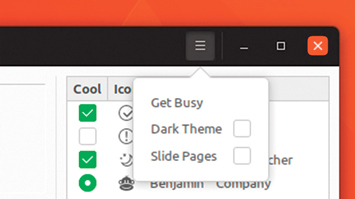
How would it look if the “x“ was orange instead of red? Maybe it looked more ubuntu-ish and was still having enough of a “warning appeal“.
It already is ![]()
1 Like