It’s done!
I’ve created a little fork of communitheme that you can use to make the titlebars white - essentially this is like a sane version of radiance. Will be based on Adwaita of course but that will be a minor change (Will be done tomorrow).
To use it, you’ll have to do the following (BACKUP the files before doing this):
/* Add the following to the end of
admin:///usr/share/gnome-shell/theme/communitheme/gnome-shell.css: */

/* TOP BAR */
#panel {
  background-color: rgba(255, 255, 255, 0.25);
  box-shadow: 0 3px 3px 4px rgba(0, 0, 0, 0.2);
  /* transition from solid to transparent */
  transition-duration: 500ms;
  font-weight: 450;
  height: 1.86em; }
  #panel.unlock-screen, #panel.login-screen, #panel.lock-screen {
    background-color: transparent; }
  #panel #panelLeft, #panel #panelCenter {
    spacing: 4px; }
  #panel .panel-corner {
    -panel-corner-radius: 0;
    -panel-corner-background-color: rgba(255, 255, 255, 0.35);
    -panel-corner-border-width: 2px;
    -panel-corner-border-color: transparent; }
    #panel .panel-corner:active, #panel .panel-corner:overview, #panel .panel-corner:focus {
      -panel-corner-border-color: #eb6637; }
    #panel .panel-corner.lock-screen, #panel .panel-corner.login-screen, #panel .panel-corner.unlock-screen {
      -panel-corner-radius: 0;
      -panel-corner-background-color: transparent;
      -panel-corner-border-color: transparent; }
  #panel .panel-button {
    -natural-hpadding: 12px;
    -minimum-hpadding: 6px;
    font-weight: 450;
    color: #F7F7F7;
    text-shadow: none;
    text-shadow: 0px 1px 2px rgba(0, 0, 0, 0.7);
    transition-duration: 100ms; }
    #panel .panel-button .app-menu-icon {
      -st-icon-style: symbolic;
      margin-left: 4px;
      margin-right: 4px; }
    #panel .panel-button .system-status-icon,
    #panel .panel-button .app-menu-icon > StIcon,
    #panel .panel-button .popup-menu-arrow {
      icon-shadow: 0px 1px 2px rgba(0, 0, 0, 0.4); }
    #panel .panel-button:hover {
      color: white;
      text-shadow: 0px 1px 2px rgba(0, 0, 0, 0.4); }
      #panel .panel-button:hover .system-status-icon,
      #panel .panel-button:hover .app-menu-icon > StIcon,
      #panel .panel-button:hover .popup-menu-arrow {
        icon-shadow: 0px 1px 2px rgba(0, 0, 0, 0.4); }
    #panel .panel-button:active, #panel .panel-button:overview, #panel .panel-button:focus, #panel .panel-button:checked {
      background-color: rgba(0, 0, 0, 0.01);
      box-shadow: inset 0px -3px #E95420;
      color: white; }
      #panel .panel-button:active > .system-status-icon, #panel .panel-button:overview > .system-status-icon, #panel .panel-button:focus > .system-status-icon, #panel .panel-button:checked > .system-status-icon {
        icon-shadow: none;
        /*black 0 2px 2px;*/ }
    #panel .panel-button .system-status-icon {
      icon-size: 1.09em;
      padding: 0 5px; }
    .unlock-screen #panel .panel-button,
    .login-screen #panel .panel-button,
    .lock-screen #panel .panel-button {
      color: white; }
      .unlock-screen #panel .panel-button:focus, .unlock-screen #panel .panel-button:hover, .unlock-screen #panel .panel-button:active,
      .login-screen #panel .panel-button:focus,
      .login-screen #panel .panel-button:hover,
      .login-screen #panel .panel-button:active,
      .lock-screen #panel .panel-button:focus,
      .lock-screen #panel .panel-button:hover,
      .lock-screen #panel .panel-button:active {
        color: white; }
  #panel .panel-status-indicators-box,
  #panel .panel-status-menu-box {
    spacing: 2px; }
  #panel .power-status.panel-status-indicators-box {
    spacing: 0; }
  #panel .screencast-indicator {
    color: #F89B0F; }
  #panel.solid {
    background-color: #E8E8E7;
    /* transition from transparent to solid */
    box-shadow: 0 1px 1px 1px rgba(0, 0, 0, 0.4)!important;
    transition-duration: 1000ms; }
    #panel.solid .panel-corner {
      -panel-corner-background-color: white; }
    #panel.solid .panel-button {
      color: #000;
      text-shadow: none; }
      #panel.solid .panel-button:hover {
        color: #000; }
    #panel.solid .system-status-icon,
    #panel.solid .app-menu-icon > StIcon,
    #panel.solid .popup-menu-arrow {
      icon-shadow: none; }

/* Add the following to the end of
admin:///usr/share/gnome-shell/extensions/ubuntu-dock@ubuntu.com/stylesheet.css: */

#dashtodockContainer {
    background-color: rgba(255, 255, 255, 0.2)!important;
}

#dashtodockContainer .notification-badge {
    /* Change the background here to whatever your variant of Adwaita-Ubuntu uses */
    background-color: #23A5D4;
}

#dashtodockContainer.running-dots .app-well-app.focused .overview-icon, #dashtodockContainer.dashtodock .app-well-app.focused .overview-icon {
    /* Make the current app indicator dark */
    background-color: rgba(0, 0, 0, 0.2);
}

#dashtodockContainer #dash {
    /* Make the dash white by default */
    background-color: rgba(255, 255, 255, 0.2)!important;
}

#dashtodockContainer.opaque {
    background-color: rgba(255, 255, 255, 0.8)!important;
}

#dashtodockContainer.transparent {
    background-color: rgba(255, 255, 255, 0.1)!important;
}
Instructions are also in the Github repo. I will obviously create a real adwaita theme out of this in the future as this is a working (Even transparency changes work) but quite ugly solution 
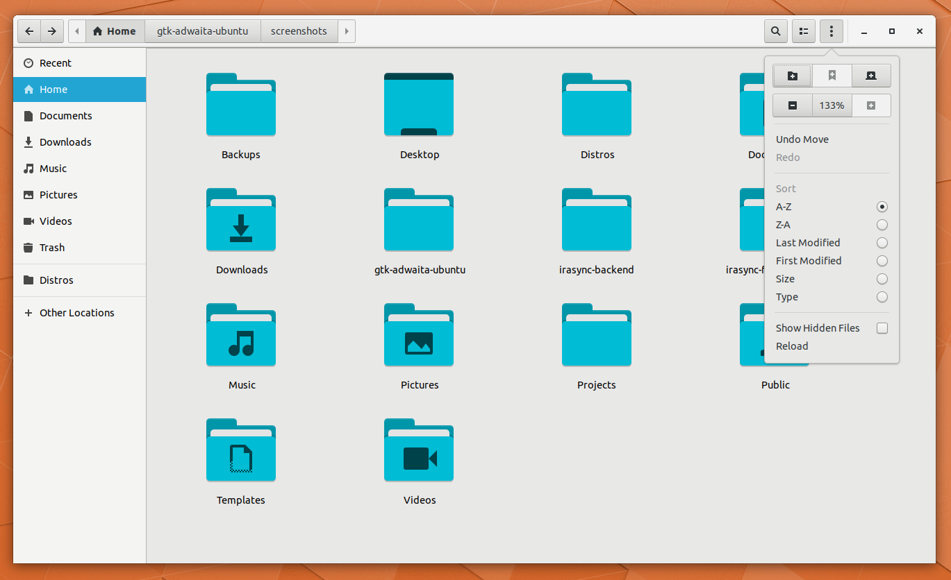
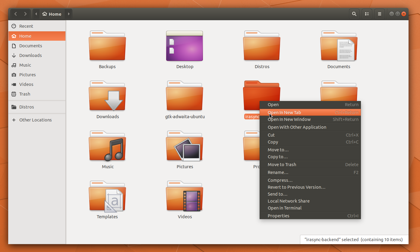
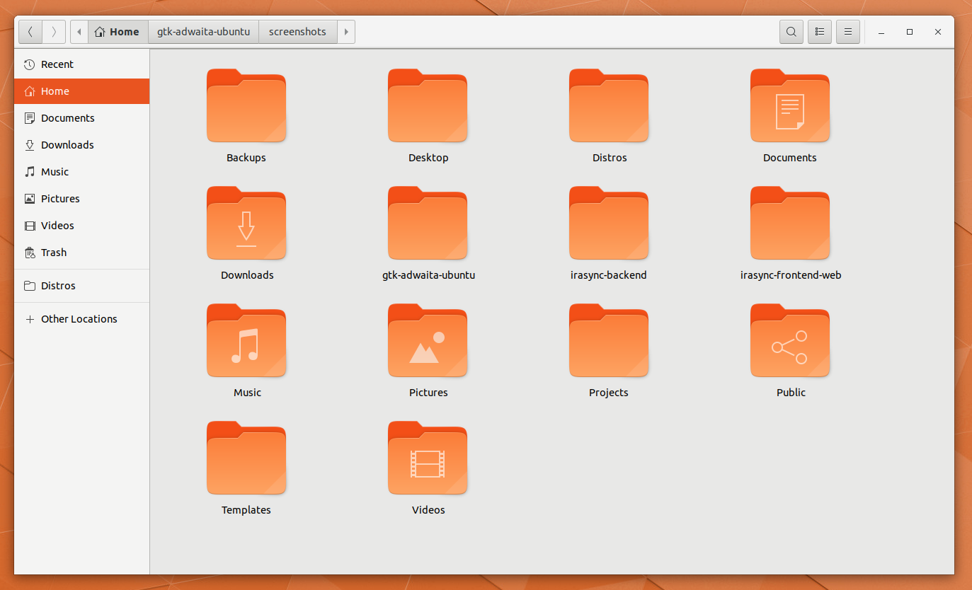
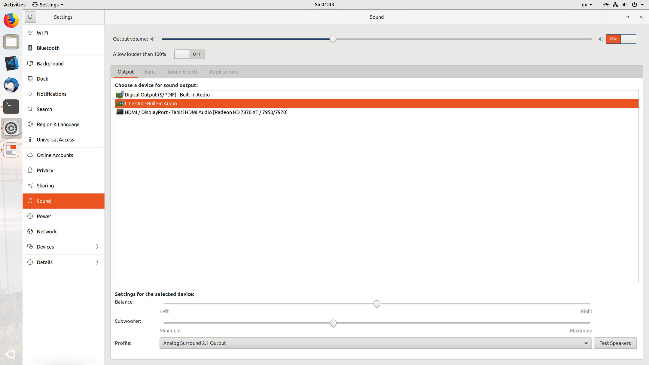
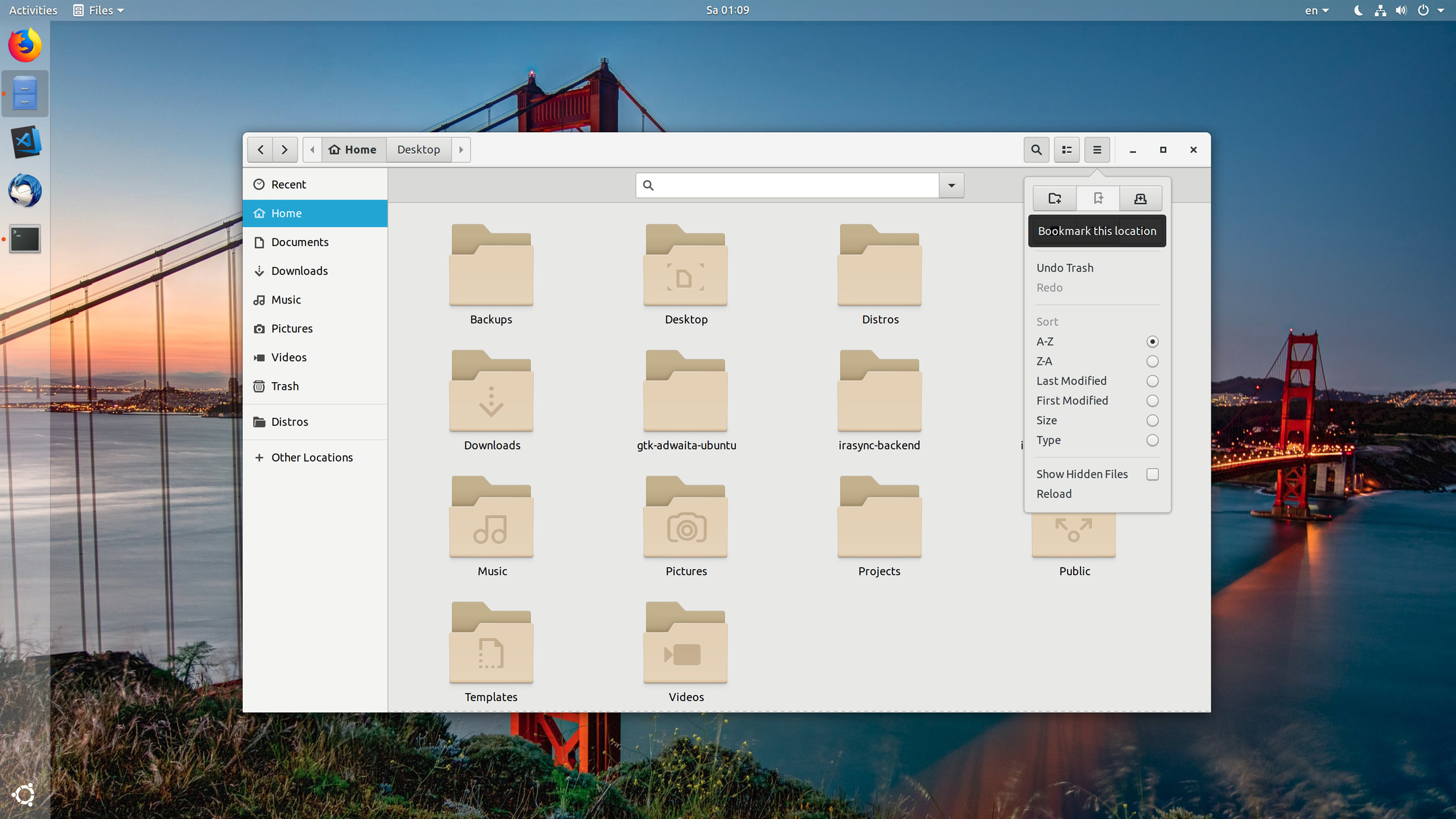
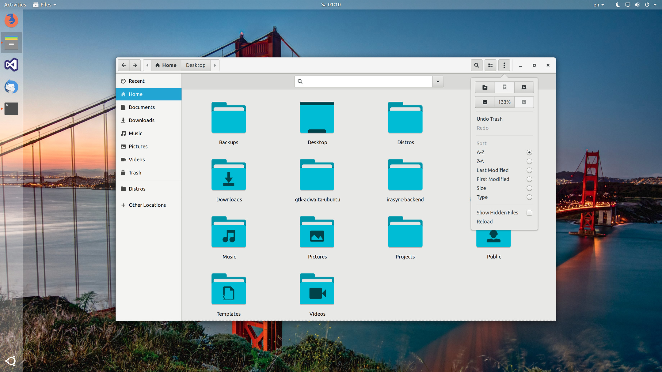
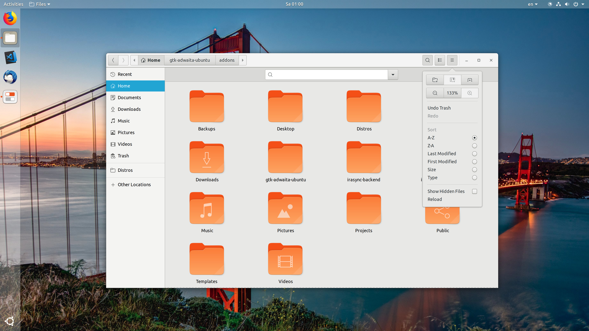
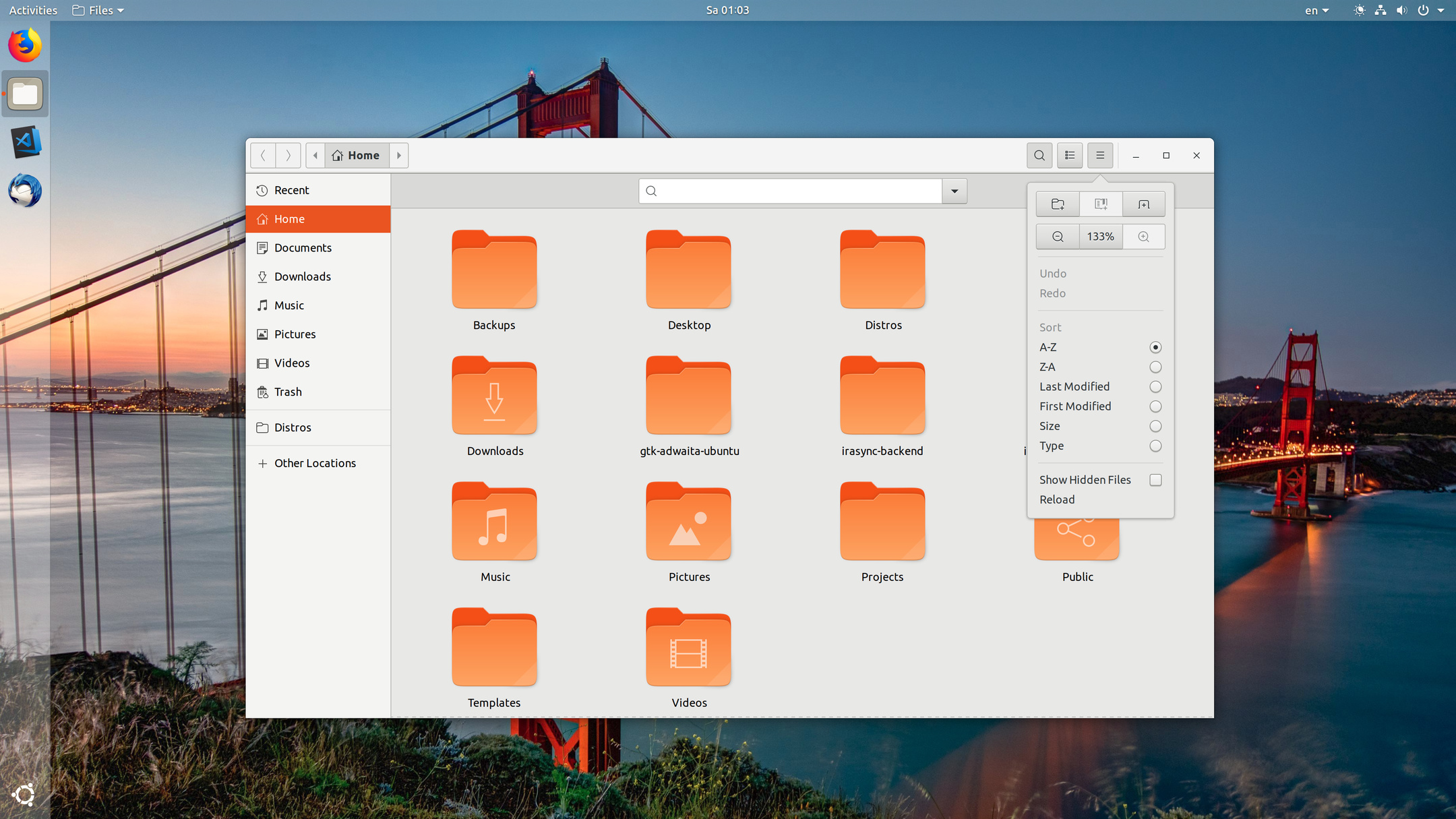
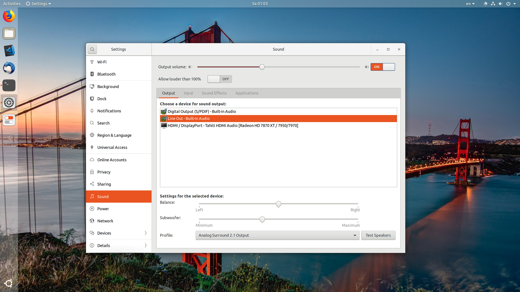
Below are some screenshots from the different variants:
I personally start to really like the blue version with adwaita/suru icons now as well, especially when highlighting things and in the context menu, it does indeed look … fresh, like the light water on a tropical island’s beach 
What do you think about it? This is a very minimal edit and especially when used with Adwaita it could be done with less then ~20 LOC.